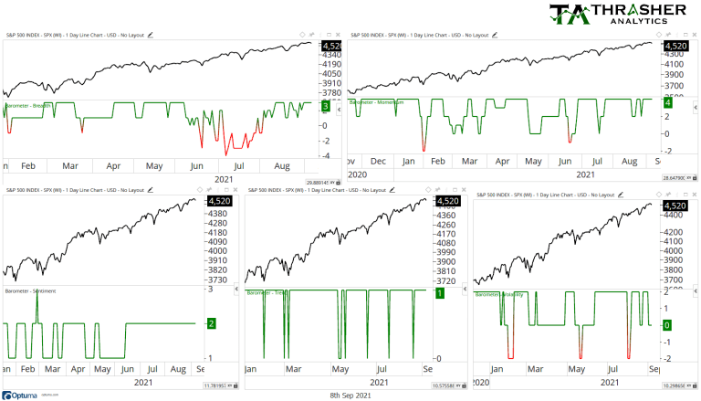
There are many ways to slice and dice the market but in today’s post I want to share one of the primarily models that gets discussed each week in the Thrasher Analytics letter to subscribers….
As a practitioner technical analysis and a Chartered Market Technician (CMT), I have a lot of data, tools, and forms of analysis at my disposal, making the paradox of choice a potentially large roadblock. The more data and tools we have access to as technicians, at times the muddier the resulting analysis and conclusion can be. For instance, if there is a buildup in bullish momentum divergences, and improving breadth, but sentiment and volatility appear bearish – what’s the ultimate takeaway?
Therefore, I lean more towards being qualitative in my primary processes and use models to act as a major guide in my decision making. This doesn’t mean I entirely ignore the other charts and market study’s I run through – that would create too much of tunnel vision. In fact, I share a whole host of tools and analysis in my weekly Thrasher Analytics letter. But a while back I had a few subscribers ask if there was a way to distill everything down to a single data point. I took on that challenge and through extensive work, built the Market Health Report which is now my principal tool for managing risk personally and one of the primary tools I share and discuss every week in the letter.
This tool is not intended to call tops or bottoms or pinpoint short-term wiggles in the S&P 500 or a single stock. Instead, it tells a story of the health of the underlying market at potentially critical junctures. Rather than be used to signal market peaks and bottoms, the Market Health Report’s goal is to identify periods in the market where selling is likely to continue and be just a brief dip. Just like you would not go to the doctor for a check-up every day, we don’t need to concern ourselves with the MHR every tick of the S&P 500.
Through my study of market history I found that 15-day lows were common areas the market hit a fork in the road: to either be near a reversal back higher or to begin a possible more protracted move lower. With that key understanding, 15-day lows became the time when we’d take the market’s temperature and evaluate what the Market Health Report was showing.
But what do we want to evaluate? For each technician and trader there will likely be varying “rankings” of what they think is most important to look at. But for me it gets distilled down to 5 categories: breadth, momentum, sentiment, volatility, and trend. Through review of those 5 categories I feel I have a solid grasp on what the market looks like. Are these the holy grails to technical analysis? Of course not. They are simply my preferred gauges to analyze. Rather than relying entirely on just one of them, they work as a team, some show strength to make up for weakness in another but when they are grouped together we can get a better picture of how healthy (or not) the market potentially is.

On each chart I share of the MHR, I plot the score given by the composite tool based on the 5 categories at each 15-day low. In simple terms, readings of -5 are bearish and above 7 are bullish (there’s a little more to it than that, but for today’s post’s purposes that will suffice). Also, don’t get too hung up on the arrows, I go into greater detail with what they mean in the summary PDF that is sent to subscribers and in each week’s letter.
With that, let’s look at some examples….
4th Quarter 2018
Below is the S&P 500 during the second and third quarters of 2018. The dotted line markets the 15-day low with the Market Health Report at the bottom and the daily score at 15-day lows shown below the price candles. You can see in May the S&P 500 dipped 4% but the MHR was at just a -3, signaling the market was still healthy and the dip should be brief. The same can be seen in early July, the MHR was at a +7 and a few days later stocks bottomed and continued higher. Then we moved into the fourth quarter and the MHR dropped to a -6, the lowest level in over six months. The data below the surface was turning bearish and the current 5% dip could see further downside, which we of course know was correct as stocks fell 20% before bottoming out that December. The MHR didn’t call the top, it took a 5% slide in the index to get us to a place where we would want to stop and take the temperature of the financial market, allowing us to better prepare if needed.

1st quarter 2020
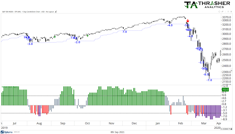
Let’s look at another recent example, the March 2020 drop. In the months prior the covid crash, there were a few dips to 15-day lows in October ’19, December, ’19, and January ’20. Each of these declines had fairly strong MHR scores or didn’t see price confirm weakness the following day of a low score, suggesting the dips were not expected to produce larger moves. Then we advanced into March and the first 15-day low saw the MHR drop to -5 and -6, very low figures that tell us the market may not be well and could see further downside and being confirmed by the following day’s price action. Unfortunately, that’s exactly what happened with one of the largest and fastest declines in market history. The MHR of course didn’t know how much the market would move, simply that at that snapshot in time, the 15-day low in price was accompanied by poor data from the six equally weighted inputs.

2017
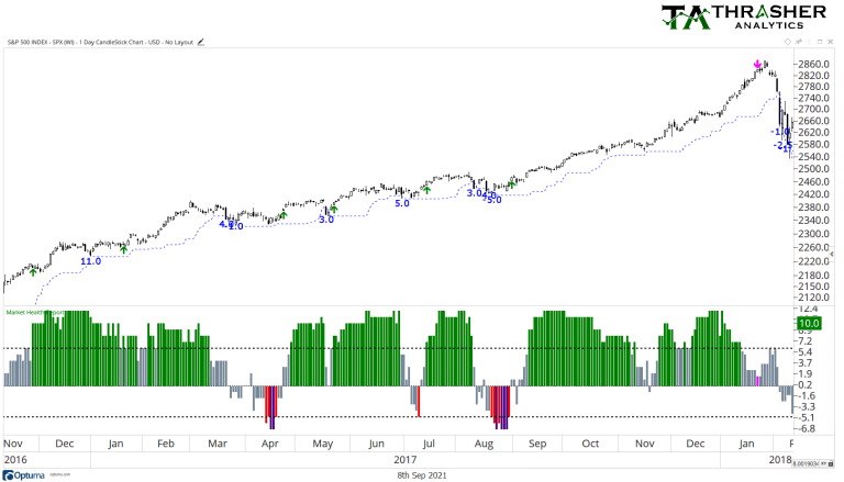
Where the Market Health Report can be very useful is in periods like 2017 and similarly to 2021, when the market is in a strong trend higher, and dips continue to get bought. Back in 2017 the MHR remains supportive of the equity market, suggesting each initial 15-day low was likely to be a shallow dip, up until August when the data began to break down and gave a bearish score of -5 but was quickly reversed before the end of the month.

Today
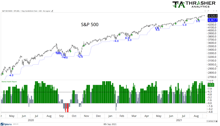
What’s the MHR looked like over the last 12+ months? Like 2017, pullbacks have been minor, and we actually haven’t had an MHR reading under zero since February, showing just how strong the composite of data has been. Since February, each 15-day low has been accompanied with a reading of 0 or higher, suggesting the equity market is taking the bullish turn in the proverbial forked road.

While there has been plenty of charts to suggest bullish or bearish market periods, of which I try to share both publicly and in the Thrasher Analytics letter. The current strong bullish trend of course won’t always be around and obviously there will be periods where the MHR gets things wrong. Nothing is perfect! By having a single model that distills the data you feel is most important and unimpeded by personal bias, and emotion can be sidelined.
Related: Using COT Data To Track The Markets


