
Trending

In Spruce Pine, North Carolina, one small area supplies the world with high-purity quartz. Spruce Pine Quartz ranks among the world’s most important economic minerals. The following description is courtesy of a Wired article entitled- The Ultra pure, super-secret sand that makes your phone possible.
“Spruce Pine, it turns out, is the source of the purest natural quartz—a species of pristine sand—ever found on Earth. This ultra‑elite deposit of silicon dioxide particles plays a key role in manufacturing the silicon used to make computer chips. In fact, there’s an excellent chance the chip that makes your laptop or cell phone work was made using sand from this obscure Appalachian backwater….”
Conway’s Material World points to a concern regarding the importance of quartz from Spruce Pine: They claim that if terrorist sabotage of the mines occurred, “you could end the world’s production of semiconductors and solar panels within six months.” They note that the industry could adapt without the quartz, but finding a new process or alternative substance could result in a “grisly few years.” Given the importance of semiconductors, such a chip shortage would devastate the global economy.

Market Trading Update
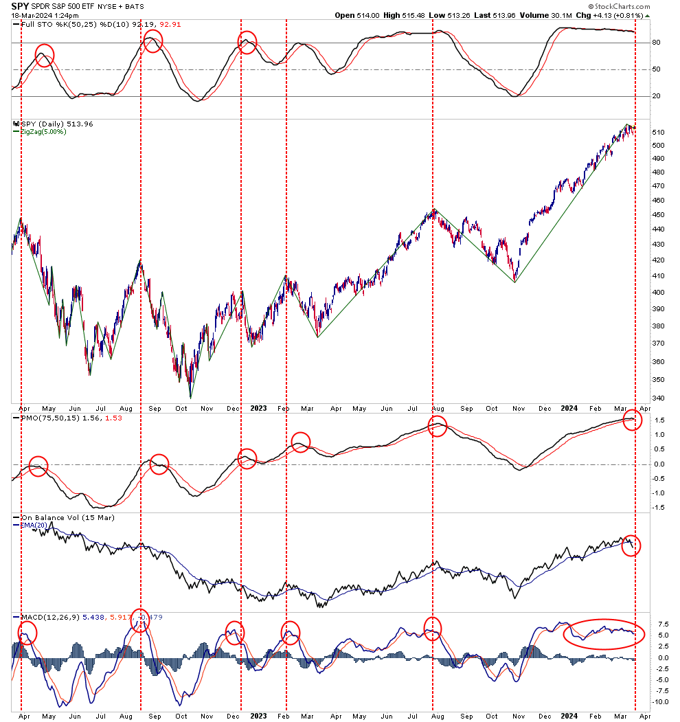
Yesterday, as has been the case for the last several months, the market rallied off the 20-DMA as the algos kicked in to buy the mega-capitalization stocks. With “On Balance” volume turning lower and the price-momentum oscillator (PMO) closing in on a “sell signal,” we may be approaching the corrective phase of this bullish advance. However, we have discussed that risk over the last several weeks, and the market has continued to climb slowly.
While this continues to be a “boy who cried wolf” scenario at the moment, it is important not to get lulled into a sense of complacency. As in the old fable, once the sheepherders stopped responding to the boy’s cries of danger, the wolves devoured the sheep. In the case of the markets, ignoring the warning signs in a market lulled into complacency is easy. However, as is always the case, when you stop paying attention to the warning signs, the “wolves” find their prey.
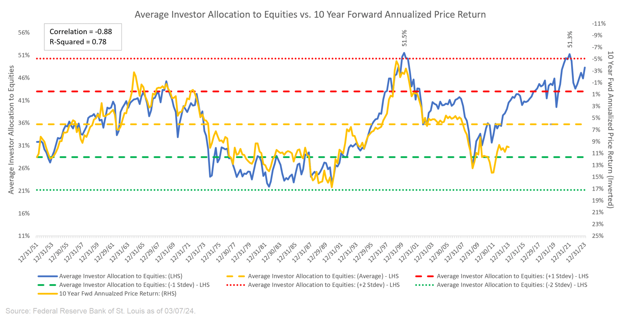
Equity Allocations Are At Cautionary Levels
The following analysis and graph are courtesy of Jim Colquitt via his Substack service. The blue line in his graph below shows the percentage of an average individual’s portfolio allocated to equities. For instance, currently, it is nearly 50%. In 2021, it peaked at its highest point since 1999. It then declined with the market from two standard deviations to one but remained historically high. Again, it is approaching two standard deviations as sentiment runs high in the equity market. So, what might this mean for future equity returns? Per Jim:
The yellow line in the chart shows the “10-Year Forward Annualized Price Return” of the S&P 500 Index. This tells us what the 10-year forward return was for the S&P 500 Index from the corresponding point on the blue line. This line maps to the right-hand scale of the chart and the values have been inverted to better show the relationship between the two metrics.”
His conclusion is not that we should expect negative returns annually for the next ten years. Instead:
It is important to remember that this does not suggest that the S&P 500 is going to return -1.19% each year for the next 10 years. Instead, it suggests that over the next 10 years, the annualized return over that entire 10-year period will be somewhere in the ballpark of -1.19%.This likely means that we will have a recession or two over that 10-year period which will be accompanied by outsized drawdowns followed by outsized rallies all of which culminating in a 10-year annualized return of somewhere in the neighborhood of -1.19%.
This chart serves as an important warning. However, and this is important, the indicator doesn’t warrant staying out of equities for the next ten years. It does warrant paying close attention to the risks you are taking and knowing where the exits are. It also argues that active management will likely be well rewarded over the next ten years versus a passive approach.
Got Energy?
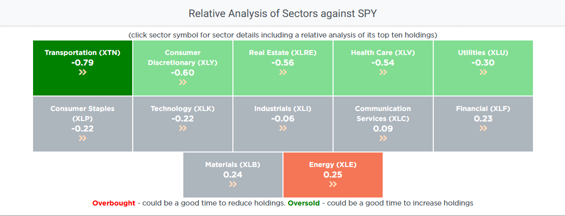
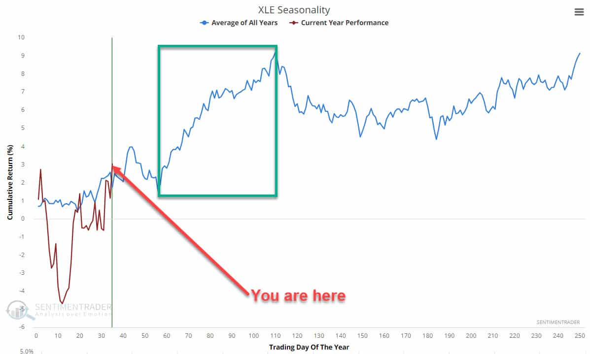
As shown below, using our Relative Analysis tool, the energy sector (XLE) is now the most overbought sector compared to the S&P 500. For good stretches of the last six months, energy was among the most oversold sectors. Over the last month, energy has been the leading sector, up 5.19%. The following graph from Sentimentrader argues that the energy sector may continue to do well. It shows we are entering a seasonally bullish time for the sector.
“Want to have better long-term success in managing your portfolio? Here are our 15-trading rules for managing market risks.”
Related: Microstrategy Investors Are Buying Bitcoin at a Massive Premium