

Trending

After a newsworthy week, it seems like an opportune time to check in on some important charts and tables that we have referenced from time to time. These are some of the ones that seem most relevant right now.
First, we have updated the table that shows the response of the S&P 500 Index (SPX) after each of the FOMC rate decisions since the emergency meeting during the Covid crisis. Somewhat surprisingly for an “in-play” meeting during a quarterly expiration week, the market response was rather muted. The one- and three-day moves were essentially no different from those seen during most of the recent timeframes, whether considering the major expiration or not, and the 3-day range was actually well below average.
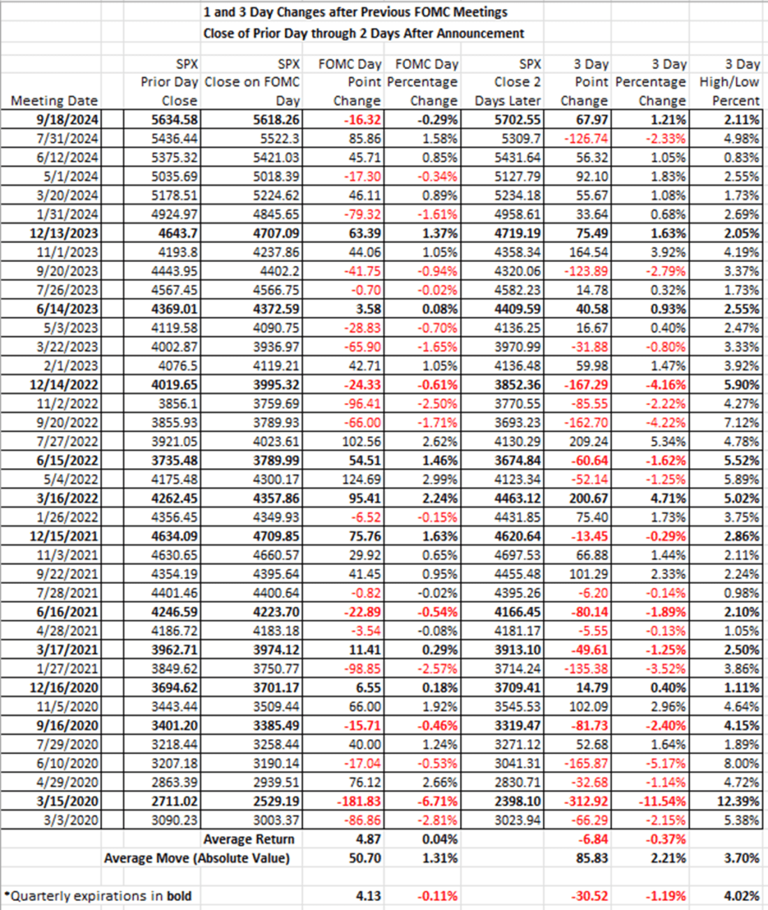
Source: Interactive Brokers
The same holds true if we look at the period since the Fed announced its intention to raise rates after the crisis:
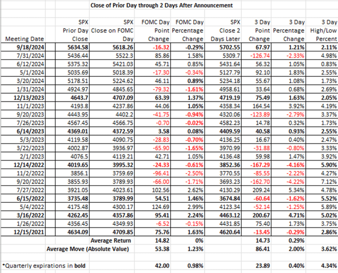
Source: Interactive Brokers
Staying on the topic of monetary policy, here is a graph showing the size of the Federal Reserve’s balance sheet from the months just before covid, through the massive quantitative easing (“QE”) that occurred during the crisis, and the quantitative tightening (“QT”) that has ensued. We see a bump in the top line, the total assets, during the banking crisis of early last year, and we also can detect the slowing pace of QT in the most recent dates. But it is also quite apparent that QT had no effect on the rise in SPX. It has proceeded apace despite the shrinking balance sheet. Quite frankly, it remains enormous by historical standards:
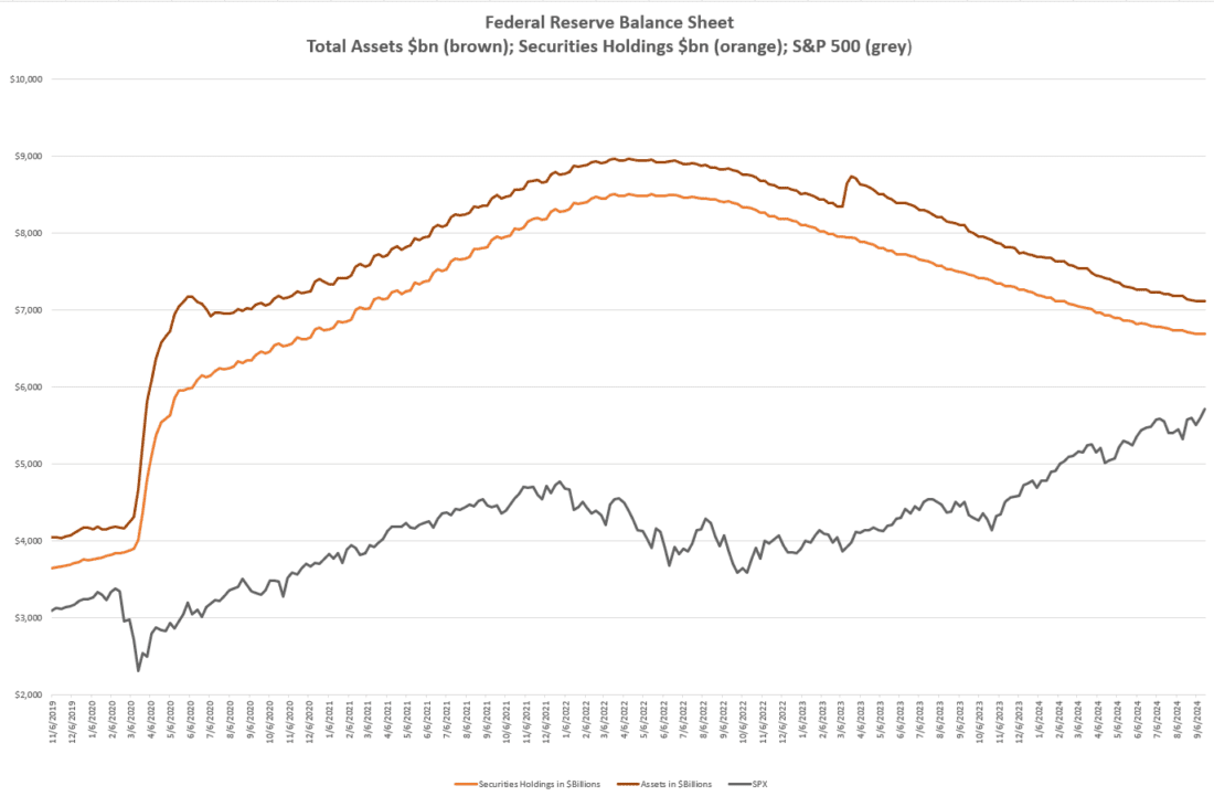
Source: Interactive Brokers
Below we see the effects on relative bond pricing as the result of Fed rate policies vis-à-vis recessions by showing the spread between 2-year and 10-year Treasury yields. It seems fair to say that the significant inversion of the past two years has normalized. Unfortunately, when we view that data compared to the “official” start dates of recessions since 1985, we see that the recessions only began after the yield curve normalized.
Spread Between 2-Year and 10-Year US Treasury Yields (histogram), with NBER Recession Start (red) and End (green) Dates
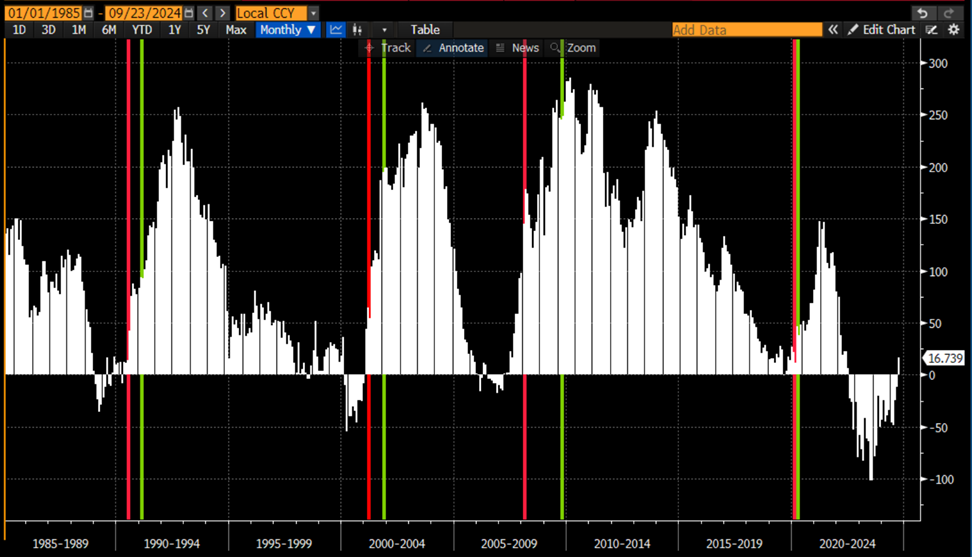
Source: Bloomberg
Finally, we offer a bit of perspective for those who might be expecting Fed Funds to return to the interest rate policies that prevailed during the roughly 12 years between the Global Financial Crisis (“GFC”) and Covid, we offer a bit of historical perspective. The chart below shows the effective Fed Funds rate since 1954 . We remain near the high-end of recent observations, but it should cause viewers to wonder if the 2010’s were in fact the anomaly, not the norm:
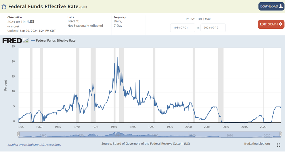
Source: Federal Funds Effective Rate (DFF) | FRED | St. Louis Fed (stlouisfed.org)
The same sort of logic should apply when we analyze real rates instead of their nominal counterparts. On a ten-year basis, we are once again at the high-end of observations this century, but well below those of the prior decades. Note that negative real rates only arose in the post-GFC period:
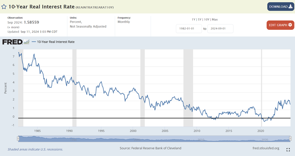
Source: 10-Year Real Interest Rate (REAINTRATREARAT10Y) | FRED | St. Louis Fed (stlouisfed.org)
Meanwhile, on a one-year basis, we are once again at the high-end of observations since 1985, though negative real rates did indeed appear after the turn of the new century. Regardless, the current real rates are not historically abnormal on a long-term basis.
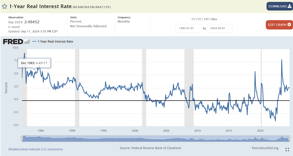
Source: 1-Year Real Interest Rate (REAINTRATREARAT1YE) | FRED | St. Louis Fed (stlouisfed.org)
The key question for rate-watchers is whether the Fed intends to return us to a policy of zero real rates. Over time, we’ve functioned quite well from both an economic and market perspective with positive real rates. But when we consider that Chair Powell literally spent much of his career as a leveraged investor – that’s the business model at private equity firms like Carlyle Group, his former place of employment – it would be understandable he erred toward the side of “too low” rather than “too high” real rates.
Happy start of autumn to those of us in the northern hemisphere.
Related: Mr. Market Loves Jerome Powell