Friday morning’s Payrolls report freaked out the bond market. But by the end of that day and so far today, stocks don’t seem to care. When we look deeper into the underlying trends in the equity market, we see that today’s performance is less about the bulk of stocks performing well than the correct stocks doing so.
Considering recent market activity, this is hardly a stretch. I was asked for a comment shortly after the numbers were released, and here was my take:

From a broad index perspective, that has proven correct. But when we look more closely, we see that most stocks are lower. On Friday, NYSE and Nasdaq Composite decliners outpaced advancers by about 3:1. So far today, as major indices bounced from modest sell-offs, the numbers still decliners outpacing advancers, though by a narrow margin.
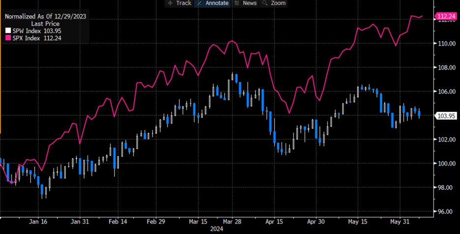
We all know that the mega-cap technology stocks that dominate the weighting of both SPX and NDX have led this year’s advance. In January we posited that “It’s NVDA and Everything Else”, and even while discussing the GameStop (GME) madness, I posited that “it’s NVDA’s market, and we’re all trading in it” (see 2:36 in link). When we take a look at SPX, which is market cap weighted, versus SPW, the equal-weighted version, we can see how much of a role that market cap is playing in the advance:
Year-to-date Normalized Chart, SPW (blue/white candles), SPX (magenta line)

Source: Bloomberg
Even as we managed to skirt the potential pitfall of Friday’s jobs report, the question to consider as we move into a consequential week that features NVDA going ex-split, the Apple (AAPL) Worldwide Developers Conference, a CPI report, and an FOMC meeting, is what happens if any of the key stocks slip up. A rush to the exits from any, let alone all of the key market drivers, could have profound consequences. The bulls need to hope that NVDA’s split is not a “sell the news” event (it hasn’t been, at least so far, thanks partly to at least three analysts raising their price targets), that AAPL has good things to offer, and that Fed Chair Powell is his usual Goldilocks self. If so, the party can continue – at least for those behind the velvet rope.
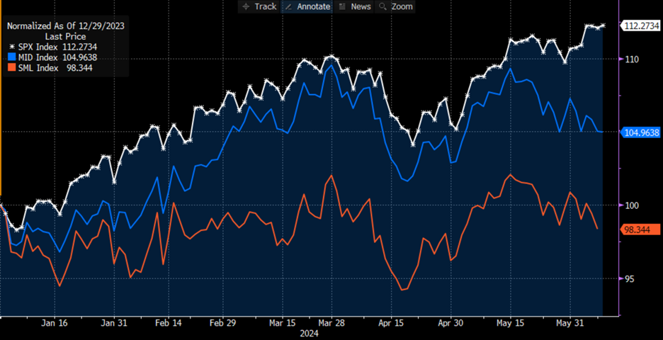
Size matters for getting into the club. Note the outperformance of SPX relative to the S&P Midcap (MID) and Smallcap (SML) indices:
Year-to-date Normalized Chart, SPX (white), MID (blue), SML (red)

Source: Bloomberg
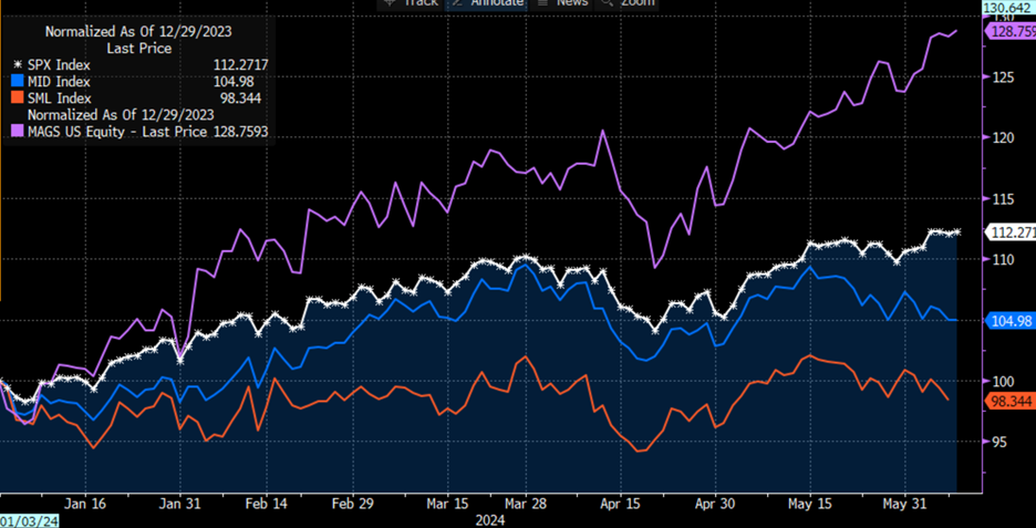
As stark as that differential is, especially over the past month, another addition to the chart makes it boldly apparent from where the performance really stems. The following chart adds in MAGS, the Roundhill Magnificent Seven ETF as a proxy for the high-flying mega cap tech stocks:
Year-to-date Normalized Chart, SPX (white), MID (blue), SML (red), MAGS (purple)

Source: Bloomberg
Can this type of narrow market leadership persist? We’d better hope so, because if the mega caps in general, and NVDA in particular, falter, then it will take an enormous rotation to keep the broad indices afloat.


