Written by: Marc Odo | Swan Global Investments
Reading the Tea Leaves
GDP growth, unemployment, and consumer confidence. Still others keep their gaze focused on government policy and base their decisions on what comes out of Congress or the Fed.
A less understood source of information is the vast market of put and call options. By analyzing factors like the VIX, skew, and the term structure of options, you can gain insight into the hopes and fears of broader, traditional markets. Since these measures are complementary, you can gain more insight by looking at the interaction of these factors than looking at them in isolation.
When markets are uncertain, you can look to these measures to identify how much uncertainty there is (VIX), where the uncertainty is located (Skew), and when uncertainty will be the highest (term structure).
THE VIX
The VIX tells us the implied volatility, or how much uncertainty there is in the market.
For many people the metric that measures volatility starts and ends with the VIX. The VIX is often called “the fear gauge” but that definition is rather loose and informal. So what does the VIX actually measure?
The VIX is an index of option prices. Just like we have indices like the S&P 500 or the Dow 30 that track the prices of a basket of stocks, the VIX is a basket of both call options and put options. The options that are included in this basket tend to be very short term in nature and cover a range of strike prices.
Ultimately supply and demand drive the prices of options.
- When investors are afraid of a market sell-off, this drives up the demand for put options.
- If investors expect the markets to run up, this drives up the demand for call options.
Either of these demand factors will drive up the prices of options, and the VIX rises accordingly.
Alternatively, if investors think the markets will remain quiet the demand for options decreases, so the prices of options fall, and the VIX declines. This is why the VIX is often referred as the “fear gauge” because it provides insight into how investors are feeling about and what they are expecting from the markets.
It is important to keep in mind that the VIX is a measure of implied volatility. Actual, realized volatility can only be measured after-the-fact. Implied volatility is a forward-looking “best guess” as to what volatility might be in the future.
Extending the comparison of the VIX to a traditional stock index, no one knows what the earnings of the S&P 500 stocks are in advance. However, the price of the S&P 500 reflects the expectations of the future earnings of those 500 stocks. If people expect earnings to be strong, the prices of the S&P 500 stocks will rise; if people expect earnings to be weak, the prices will fall. Likewise, if people expect high volatility, the VIX will rise due to demand for options; if people expect volatility to be low, the VIX will fall.
Only time will tell if the volatility implied by option prices incorporated by the VIX will be justified, just like only time will tell if the earnings of the S&P 500 justify the stock prices. But both measures are similar in the sense that they reflect the market’s forward-looking, aggregate expectations.
SKEW
Previously we mentioned that the VIX incorporates the demand for both put options and call options, which reflect the demand for downside risk protection and upside market participation, respectively. So how useful is a the VIX if it lumps both factors together?
This is where skew comes in to play. Skew measure the relative demand between put options and call options. It tells us where the uncertainty located-to the upside or the downside. Are investors placing a larger bet to downside risks or upside risks?
Under normal circumstances put options tend to be valued more highly than call options. The fear of losing money is greater than the fear of missing out on an opportunity to make money, so the prices and demand for options tends to be skewed towards puts relative to calls.
That said, markets are always in a state of flux, and the relative demand for calls and puts (and hence the skew) will vary depending upon market conditions. If the market is selling off dramatically and everyone is concerned about losses, you will likely see the skew to puts be higher than normal. Alternatively, if the market is running and people are more worried about missing out on gains, you’ll likely see calls take on a larger proportion of the skew index.
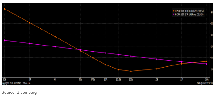
The chart below, that you can access through Bloomberg, illustrates the concept of skew. The purple line shows the relative value of two-year options and the orange line represents one-month options. The fact that the purple line is downward sloping illustrates that generally speaking puts (to the left on the graph) are more highly valued than calls (to the right of the graph). That said, the orange line is literally skewed. The put-side is much higher than the call-side of the orange line, because at this moment in time markets were very concerned about the risk of a big sell-off in the short-term.

Returning to the S&P 500 analogy, the index is comprised of different sectors. By breaking the S&P 500 down into its constituent parts we can gain insight into what is driving the market. In 2020 Technology has been doing all of the heavy lifting and sectors like Energy have been a detriment. By breaking out the volatility market into different subsegments using skew, that gives us an idea on a relative basis what is driving the options market. We can see if the supply and demand for options is being driven by calls or by puts and where people think the market is heading.
TERM STRUCTURE
Options have a wide array of expiration dates available. Options can have lifespans extending weeks, months, or even years into the future. By analyzing the relative prices of short, medium, and long-term options we can determine when options investors think uncertainty will be the highest.
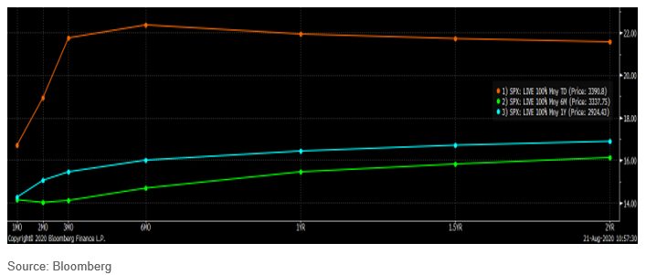
This data is typically presented as a line connecting the various expiration date, with the shorter expirations to the left and the longer expirations to the right. Although usually smooth, sometimes the term structure will have kinks in the line, especially if there is a known event risk on the horizon. The graph below illustrates the term structure for at-the-money put options on the S&P 500. The orange line is the term structure as of August 21, 2020. The green and blue lines represent the term structure six and twelve months previously, respectively.

Two takeaways stand out. First of all, the overall level of uncertainty was much higher in August 2020. Second, the peak of the current line is three to six months forward of August 2020. This hump reflects the fear and uncertainty markets have surrounding the U.S. elections in early November and on through Inauguration Day in January 2021.
Here the best analogy is not the S&P 500, but the yield curve for bonds. Like options, bonds have maturities extending out over an array of time frames. Market watchers try to forecast the relative strength of the economy based upon the levels and steepness of the yield curve. The term structures for options can be used for similar insight to the market.
Improve Your Market Insights with the Options Market Indicators
Incorporating options market insights into your regular market commentary offer an added layer to your understanding of the markets and provide some context around other indicators. You can look at VIX, Skew, and term structure individually or together to get a better sense of how much uncertainty is in the markets, where it’s location, and when it is predicted to be, respectively.
As a result, you will be able to prepare your clients’ portfolios for uncertainty and offer greater into insight into the markets during unprecedented times.


