
Trending

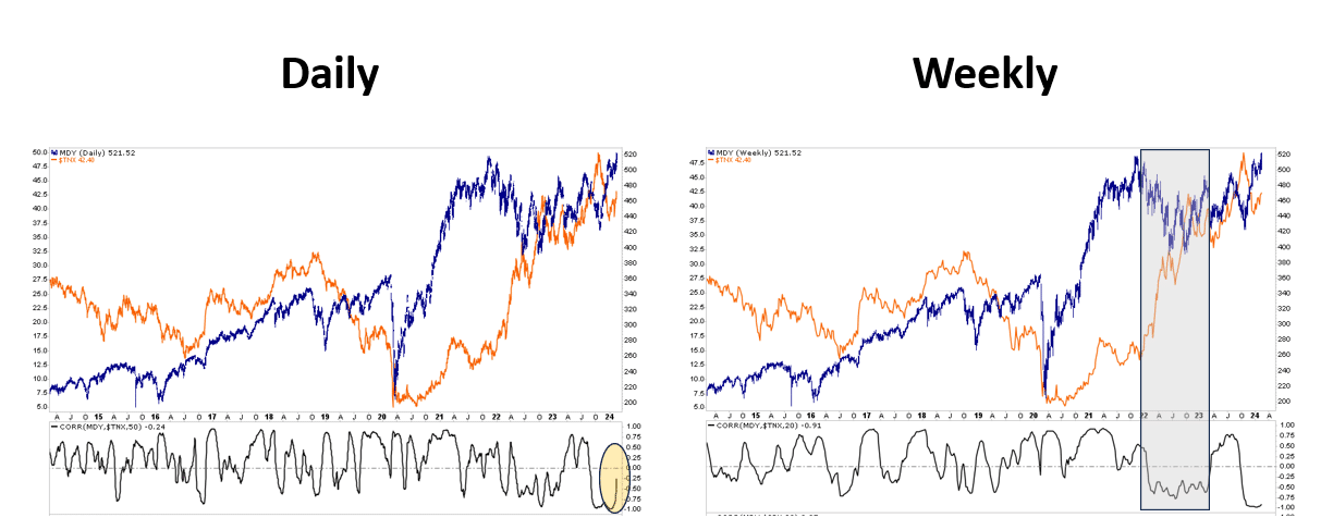
The graphs below show the daily and weekly graphs of MDY, the midcap ETF, alongside ten-year note yields. The midcap index is breaking out to record highs. Such is not surprising given the S&P 500, Dow Jones Industrial Average, and the Nasdaq also reached new records recently. What is surprising is that the midcap index is setting a record high as interest rates are starting to inch higher again.
The smaller graph beneath the daily price graph below shows the running 50-day correlation between midcap stocks and ten-year note yields. From August 2023 through year-end, the correlation was almost perfectly inverse. As yields rose, midcaps fell and vice versa. The inverse relationship is not surprising, as midcap stocks have fewer financing options than larger-cap companies, and their earnings tend to be more sensitive to interest rates. Despite the fundamental relationship, the recent uptick in yields does not concern midcap investors as the index moves upward. The weekly graph highlights the periods when the Fed was actively raising rates. As expected, the correlation was decently negative.
If midcaps can ignore higher rates in the short term and benefit more than larger cap stocks when rates decline, as we think is likely over the medium term, midcap stocks may present an alternative to the S&P 500.
What To Watch
Earnings
Economy
- No notable economic releases
Market Trading Update
With the market closing yesterday during President’s Day, nothing changed from Friday’s close. The two small sell-offs last week, following inflation reports, failed to break the 20-DMA. As such, the bullish trends remain in place for now. As noted last week, the market remains within striking distance of new highs, and we have seen some rotation from the “Mag 7” as shown in the heat map for last week.
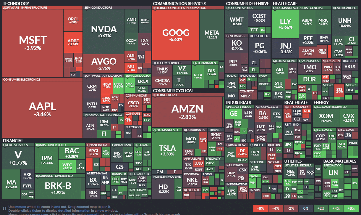
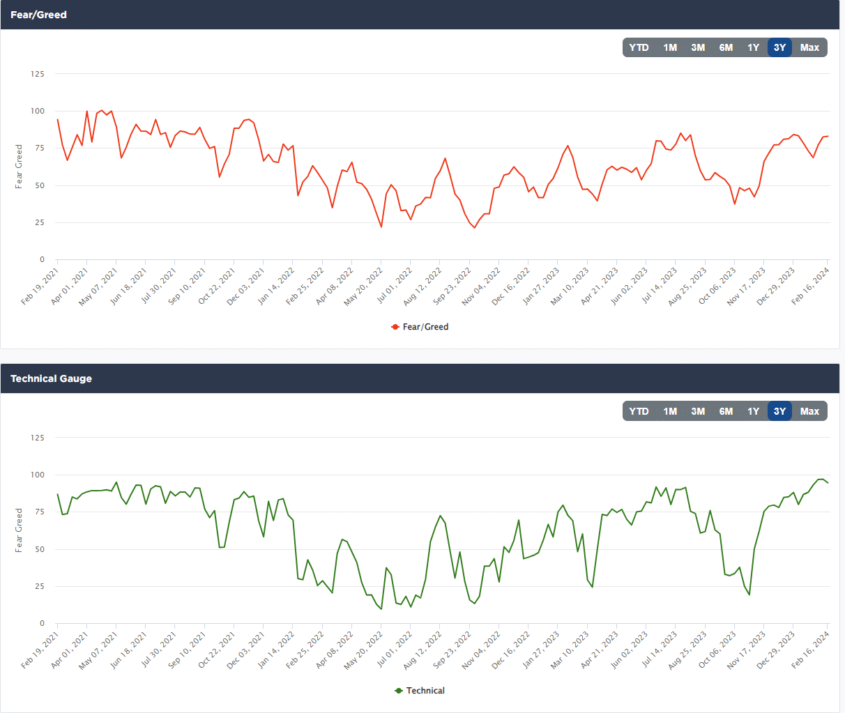
Overall, the market remains strong, and positioning is becoming very stretched on both a technical and absolute positioning basis shown in both our Technical and Positioning data.
Furthermore, despite the bullish attitudes of investors, breadth continues to deteriorate.
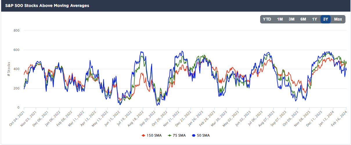
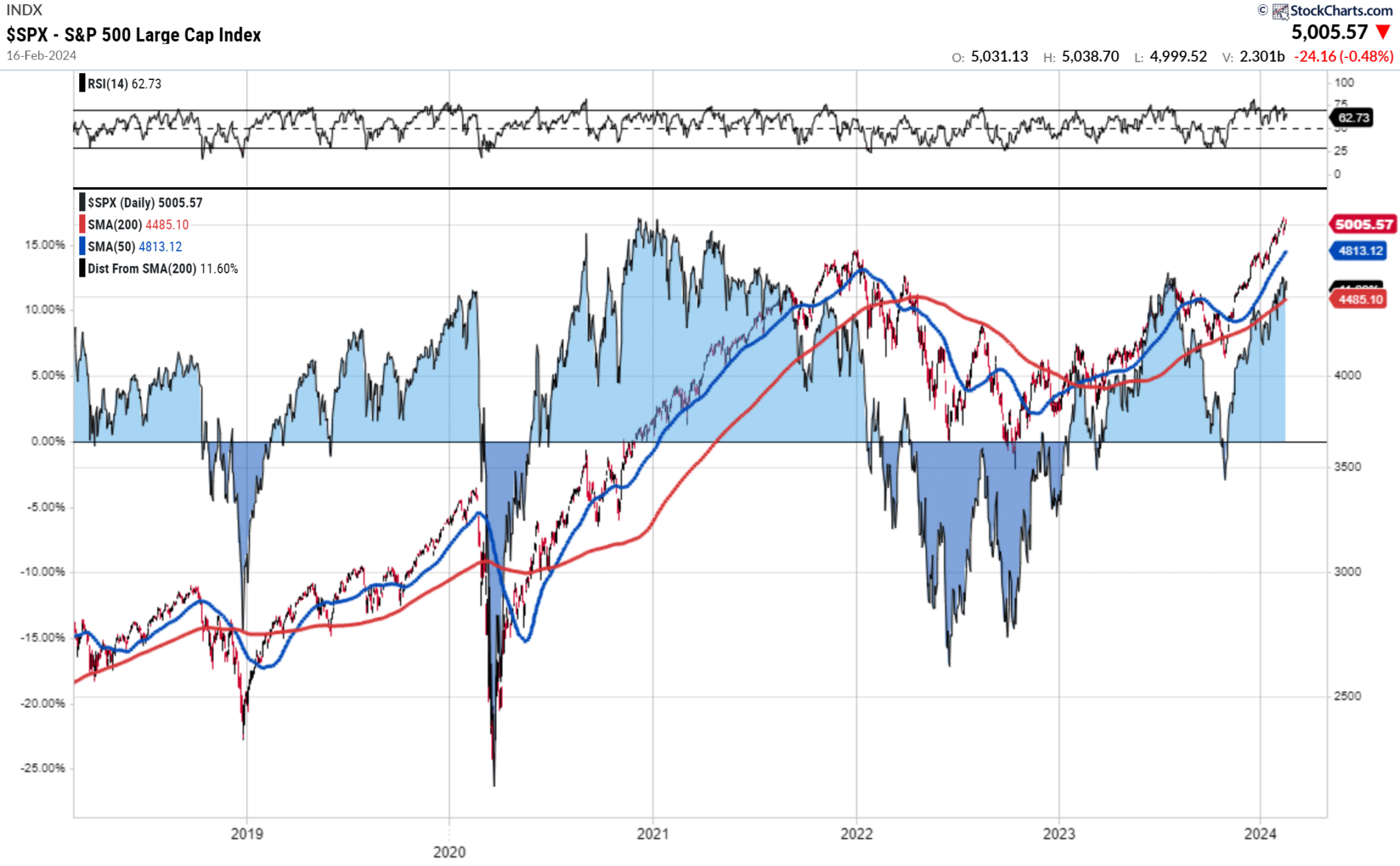
The risk of correction is elevated, so we suggest rebalancing portfolio risk to hedge against a market pullback. The deviation between the S&P and the 200-DMA is rather extreme, suggesting a 5-10% correction is becoming more probable.
The Week Ahead
The FOMC minutes on Wednesday will be followed closely for more information about what the Fed is looking for before it feels comfortable cutting interest rates. Because the minutes are more of an update than the actual minutes, the Fed may share its views on the uptick in CPI and PPI. Even if the minutes are not illuminating, a slew of Fed members speaking this week will elaborate on recent inflation data.
There is little important economic data this week. Again, initial jobless claims are worth following closely to gauge whether the employment markets are weakening.
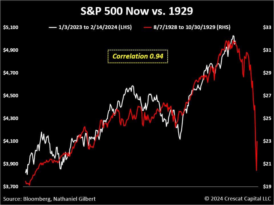
Market Analogs Reveal Your Biases But Not The Future
A reader sent us the first graph below and asked our thoughts. Our answer was that analogs could tell any story, but most often not the correct story.
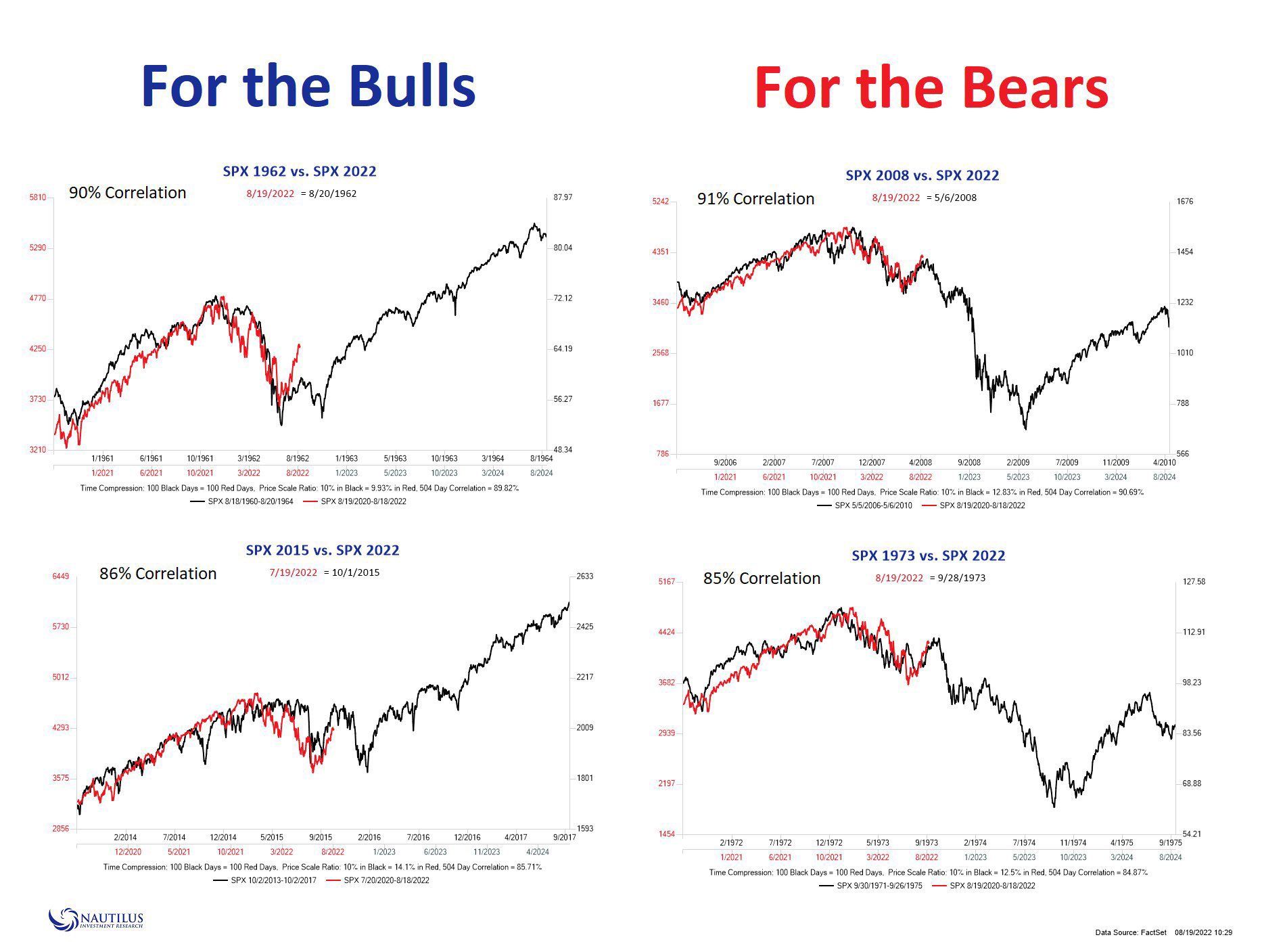
1929 was 95 years ago. A lot has changed since then. History may rhyme at times, but just because two line graphs look eerily similar doesn’t mean history will repeat. To help provide context for that statement, consider the second graphic. Nautilus shows two bullish and two bearish graphs that compare prior markets that line up well with the current market. All four have extremely high correlations.
Many times, our biases are revealed with analog graphs. While it’s important to appreciate similar patterns, we must factor in fundamentals, liquidity, geopolitics, economics, and a plethora of other factors that move markets.
PPI Follows CPI Higher
Like CPI last Tuesday, the PPI data was hotter than expected. The headline number rose 0.3%, above the +0.1% consensus estimate. The core PPI was +0.5%, well above the +0.1% estimate. Generally, service prices rose while goods prices continued to decline slowly. While the recent data point to sticky inflation, it’s important to remember that January seasonal adjustments and one-time price changes related to the new year play a bigger-than-average role. Per Zacks:
Also keep in mind that early-year economic prints tend to carry a heavier amount of inflation based on a number of things, including carry-over from the previous year’s holiday shopping season. We may need to wait until March or April to see if our longer-term trajectories remain intact toward 2% inflation.
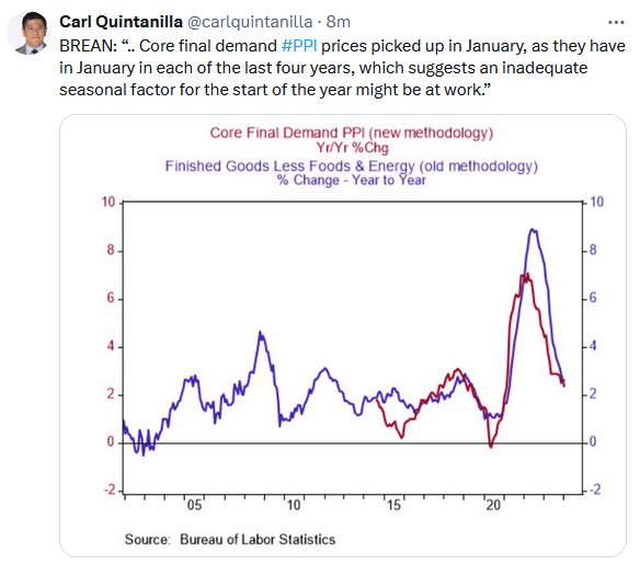
The tweet below from Carl Quintanilla further elaborates on the January effect. The graph shows that the trends lower in PPI remain firmly intact.
Tweet of the Day

Related: Is Toyota the Next Tesla?