The U.S. equity market has been in a solid uptrend since the announcement of successful vaccine trials last November. However, as we show on page 17 of the Guide, this type of market behavior is somewhat abnormal – over the past 41 years, the S&P 500 has fallen by an average of 14.3% during the course of the year, but in 31 of those 41 years has gone on to finish the year in positive territory. Put simply, equity markets are resilient, but volatility is normal.
In general, questions about market corrections are really questions of when, rather than if. There is a lot of good news priced into the equity market today, and it would not be surprising to see volatility begin to rise as investors shift their focus from an economy that is reopening to a less certain growth outlook and tighter monetary policy. However, in a world where stocks remain cheap relative to bonds, and it remains unclear as to whether high quality fixed income will provide the type of protection it has historically, where can investors look in the equity market to seek shelter during periods of volatility?
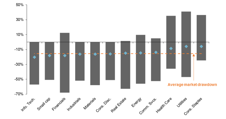
As shown in the chart below, some sectors tend to experience sharper drawdowns on average than others during periods of market stress. Specifically, and perhaps unsurprisingly, health care, utilities, consumer staples, and communication services have all historically outperformed the broader market in these environments. On the other hand, the more cyclical parts of the market like financials and small caps have been hit quite hard.
That said, the devil is always in the details. For example, average drawdowns for the technology sector are skewed by the tech bubble, while the energy sector saw positive returns during periods of market stress on two occasions since 1995. Furthermore, financial stocks rallied more than 10% as the Tech Bubble deflated and the technology sector fell by more than 50% in 2000. This means that it is important to understand historical relationships, but also look for signs of where idiosyncratic risks may be building.
In the current environment, valuation is the elephant in the room. We took a look at the average valuation by sector just before the largest decline in any given calendar year, and found that the sectors which have seen the largest drawdowns also tend to be the most expensive going into those drawdowns. As such, investors may want to focus on the intersection of valuation and historical volatility when positioning equity portfolios for what could be a bumpy ride this summer.
Sector dispersion during equity market drawdowns
Historical range vs. average, 1995 - present

Source: FactSet, J.P. Morgan Asset Management. Average market drawdown is calculated using the maximum drawdown in the S&P 500 price index on a calendar year basis. *Real estate calculations are since 2002, due to a lack of available data. Data are as of June 1, 2021.

