
Trending

Back on October 18 I posted a summary of how I use charting (technical analysis) as the last step in any investment decision. That post included a short-term look at the S&P 500, and expressed my view that the stock market was at risk of rolling over. That index fell from 4,341 to just above 4,100, a 5.5% decline in 7 trading days.
But there are no “victory laps” here. Anything can happen over short periods, and usually does. The key learning point: technical analysis is not simply looking at a single picture with lots of confusing lines on it, making a “call” and then bragging about that one time you were “right.”
To me, charting the markets is about 4 critically important things to decipher the “story” it is trying to tell us:
-
Look at many different market segments (ETFs in my case)
-
Analyze them using multiple time frames
-
Do it frequently, to gather tons of “evidence” to convert into confident decisions when they are made
-
Recognize that like anything in investing, nothing is a sure thing. So instead of focusing on “buy this” or “sell this,” know that risk of major loss is the most important thing to measure. Because anything can go up in value at any time.
September and October brought several “moments of madness” where it appeared the stock market was ready to give way, and that long-term bond yields were about to burst parabolically higher.
Currently, I see 3 types of charts, dividing global markets into 3 parts:
-
Stocks trying to piece together a rally after a steep drop
-
Long term bond prices slowing their pace of decline as yields stagnate
-
T-bill and short-term Treasury ETFs still “steady as it goes.” For instance, the 6-month T-bill first crossed above 5% in mid-April, and has not dipped below since.
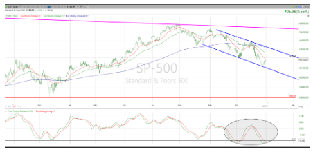
The chart above is typical of what I see across the stock market.
Key points:
-
The 2 blue lines form a “channel,” which is just a fancy name for a trading range. But that range keeps moving lower. So, while Fed Chair Powell’s comments Wednesday afternoon, Apple’s earnings report Thursday, and Friday’s monthly jobs report are all potential “don’t worry, be happy” moments for the stock market, the next 3% higher, up to the top of that blue channel, is a “gimmie” - that is, it doesn’t change the down trend.
-
The 20-day moving average is in red on the top part of the chart. It has been an excellent indicator of when the trend is changing, beyond a short-term trader’s time frame. It is down for all but the shortest-term of the 12 charting time frames I follow. I’ll wait patiently with the rest of Wall Street, but I’m not holding my breath for a near-term shift in direction.
-
The bottom section of the chart is about momentum. Markets are always cycling, whether you call it greed/fear, bull/bear or Mickey/Donald (for you Disney fans). The S&P 500 hints at an up cycle short-term, but as you can see looking backward (right to left) on the chart, past up cycles didn’t take the value of the S&P 500 to higher highs. The slippery slope for stock and bond prices remains the “primary” price trend here.
-
So, we have 3 markets in 1: stocks are trying to take the first step back toward avoiding what for most of the market would be a second straight down year. Bond prices appear to be slowing their progress to the downside, and that gets me closer to being able to fill portfolios with something other than the “3rd market,” a big helping of T-bill ETFs, and just a sprinkling of anything else.
-
Stock and bond markets have suffered pullbacks, but I’d call them more bent than broken. Let’s see what November brings. Investing in highly-charged times like these is about not getting ahead of ourselves, and taking what the market gives you. Or as I like to say, deal with the market you have, not the one you wish you had.
Related: Rolling Returns: A Way To Get More Out of Analyzing Investments