
Trending

ROAR Score weekly update
-
Our "Reward Opportunity and Risk" (ROAR) score remains at 30, where it has been since 1/21 of this year. SPY has rallied about 1% since that time.
-
This means a 2-ETF portfolio that can only be allocated to SPY and BIL would be 30% SPY and 70% BIL.
-
This is a tactical measure, and as such, if the short-term breakout I see close to happening does occur, I'll look to notch up the ROAR Score a bit. For now, the topping area around 6,000-6,100 or so, in force since mid-November, is the ruler here.
3 Quick Thoughts on markets
-
When I look through the long roster of ETFs and stocks I track for charting purposes, the message is clear: other than the U.S. President, not much has changed in terms of what impacts financial markets.
-
Oh, there will be by-products of the decades of debt buildup, the whipsaw-inducing changes to U.S. policy, inflation, bond rates, etc. But until something "sustainably" changes, i.e. for more than a few days or weeks at a time, the old saw about an object in motion staying in motion...
-
Below I highlight some market areas at potential "decision points" in the weeks ahead.
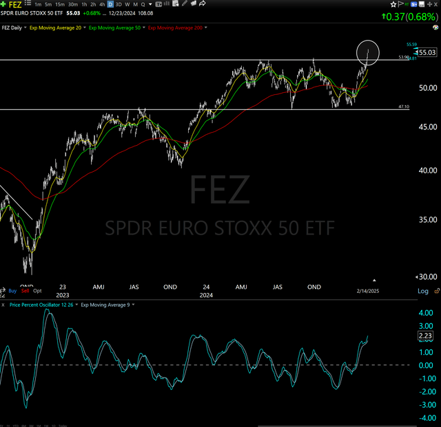
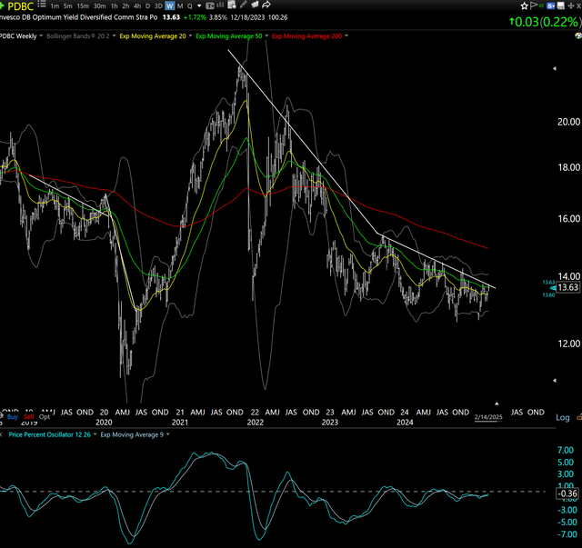
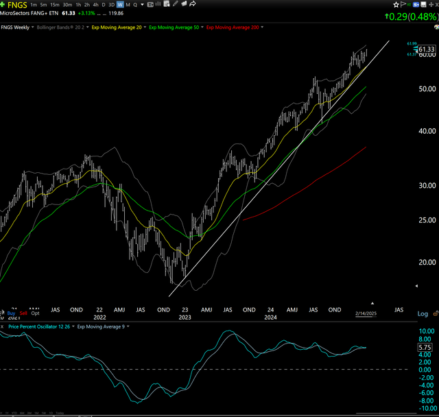
3 ETF (or index) charts I’m watching
Good news: could be a really nice breakout for Europe stocks, after treading water for a year. Bad news: I'd estimate that 80% of breakouts like this have not lasted long enough to make more than 5-10% before gravity overcomes them, for one reason or another.
Good news: that commodities ETF (which is about 50% energy, futures contracts, not stocks) is so close to a big breakout it can taste it. Bad news: it has been that close no fewer than 10 times since early 2022, and failed each time. Let's see if this is the charm.
Good news: we don't have to call them "FANG" stocks anymore, since Magnificent 7 has become the cool nickname for those mega-cap icons. Bad news: while this appears unstoppable, still, when it does break, it could look the same way heading south as it has going north. Symptom of a market where "everyone" owns the same stuff.
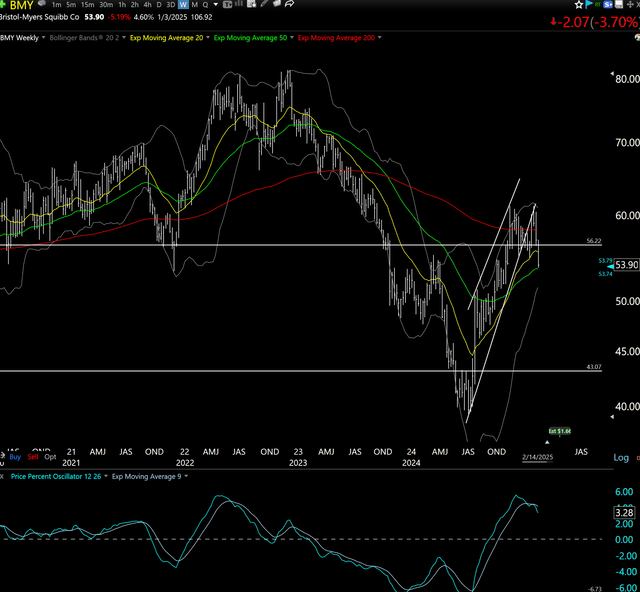
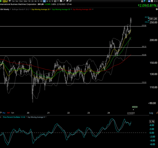
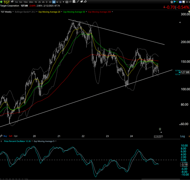
3 stock charts I’m watching
Yet another prominent U.S. blue chip in the process of becoming a "fallen angel." If it falls enough, might be a future candidate for my "dog collar" strategy. That's a long way down from here.
Yet others simply keep flying. Like this former fallen angel. The longer we look out over time, the more every stock seems to have its own cycle. The key is not to "fall in love" with them and end up being the bag-holder through the vicious part of those cycles. That's what charting helps me avoid.
Attention TGT shoppers. Be ready to either check out soon, or turn around and buy up a few aisles. This chart shows the big retailer will make up its mind soon.
Final thoughts for now
Charts are the market telling us its story. Let's listen carefully and see how that story develops.
Related: Three Years of Market Resilience: The Power of Less