
Trending

What a strong chart looks like!
With the caveat that investing is NOT about certainty, but about finding ways to put the odds of success in our favor, here is one chart from my ETF watchlist that looks about as good as it gets.
Does that mean EEM, the first and largest emerging markets equity ETF (with a pretty liquid options market fwiw) is going to go up? No! But I do think the reward potential outweighs the risk. By a lot.
This is one chart, one time frame, and before I invest in any ETF, I deep-dive into what it holds, chart the larger holdings and do all I can to convince myself not to buy it. Someone I studied under on Wall Street long ago referred to it as “try to kill the idea, and if you can’t that’s when you give yourself permission to buy it.”
Then, there’s the more important question, as I write here a lot: how much to own as a percentage of the portfolio? That’s what I discuss with paid subscribers each time I make a move in the 7-ETF model portfolio here, as well as in the 3 portfolios I run for myself and discuss over at www.sungardeninvestment.com.
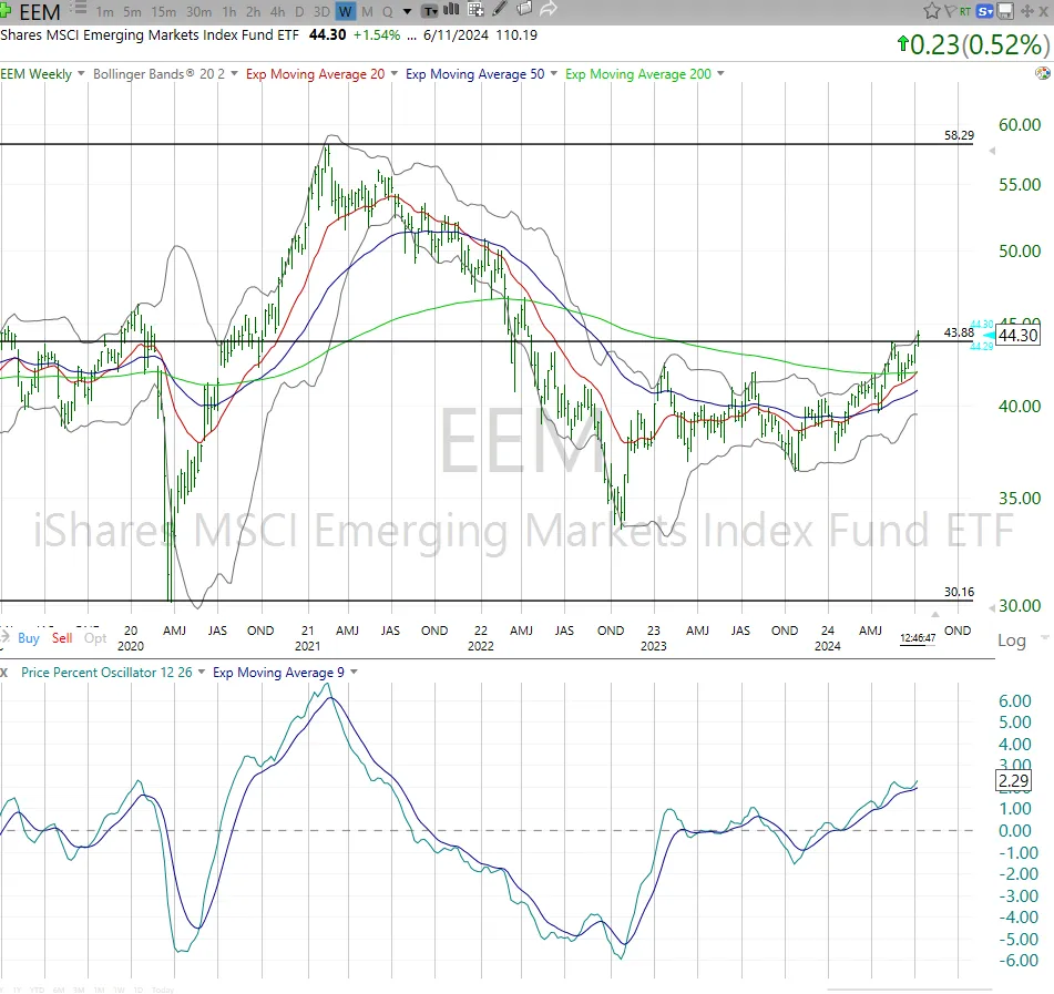
There’s potential upside to the top of the range in EEM, which is about 30% north of today’s price. Downside risk looks to be initially around $40, but a dip through that could see $36-$37 in a hurry. Remember, this is emerging markets.
If you have any questions on this or any other aspect of the technical analysis work we do at Sungarden and ETFYourself.com, send us a note in the chat or email us at info@sungardeninvestment.com.
PERFORMANCE THAT MATTERS
This week, I have added a column, highlighted in yellow. Why add more data to an already data-filled table? Because this section of our Thursday letter is “performance that matters,” and as you can see, the past 2 months and 10 days have been something to behold…and something any serious investor should be aware of.

Jim Cramer on CNBC said this morning that this might be “the greatest stock market in history.” I think that holders of about 1/20 of the 1,000 largest US stocks would agree. The rest should be wondering what he is talking about. This recent period has been, to me, where the stock market went from late stage rebound from the 2022 debacle, to the start of what might be a melt up phase.
The thing about melt ups is that they are super-strong…until the break. And then, as with the popular TV series title they can quickly start “breaking bad.” It is way too early to gauge that.
But that yellow-highlighted column indicates just how uneven things have been lately.
-
10 of the biggest stocks (all 10 holdings of FNGS) collectively advance at a rate of 3%…per week!
-
Meanwhile, the average stock (EQAL) gained less than 1/10 of that (a.k.a. a more “normal” return of 2.3% in that span, or about 1% a month - a good pace for all but the extremely greedy)
-
As I write this on Thursday afternoon, another 1-day pullback is firmly in progress. That means little to me, but when I combine it with the above table, it tells me that reward potential AND risk are high here in mid-summer.
As they say, trees don’t grow to the sky
But they do grow until they stop
Related: What Investors Should Really Take From Last Week’s Debate