
Trending

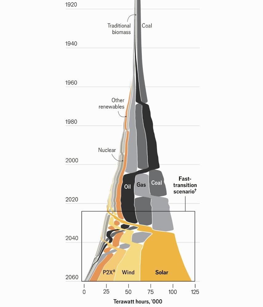
The unique graph below caught our attention, compelling us to read Solar Power Is Going To Be Huge by the Economist. The graph shows that solar energy will be the primary energy source for the world by 2040 under its “fast transition scenario.” The Economist article walks through some stats on the growth of solar energy as well as obstacles. Given the immense growing demand for electricity from AI data centers and EVs, it’s worth appreciating what energy sources will fuel the power grid and their respective investment opportunities. For more on the topic, we wrote a three-part article, which can be accessed here (parts ONE, TWO, and THREE ).
The Economist shares some interesting statistics on the rise of solar energy. For instance, solar energy is on track to produce “more electricity than all the world’s nuclear power plants in 2026, than its wind turbines in 2027, than its dams in 2028, its gas-fired power plants in 2030 and its coal-fired ones in 2032.” The increasing use of solar energy is due not only to its environmental benefits but also its falling cost. Per the Economist:
Since the 1960s…the levelised cost of solar energy—the break-even price a project needs to get paid in order to recoup its financing for a fixed rate of return—has dropped by a factor of more than 1,000.” Over the period, “prices dropped by a factor of 500. That is a 27% decrease in costs for each doubling of installed capacity, which means a halving of costs every time installed capacity increases by 360%.
The Economist makes a strong case for solar energy being dominant in fifteen years. If they are correct, there are some investment ideas worth researching with solar panel and battery manufacturers and producers of solar energy. However, investors must also consider the near future. Specifically, which energy source can fuel the current rapid expansion of power grids today and for the next fifteen years? As portrayed in the graph, natural gas is likely to remain the primary fuel for the power grid for at least another ten years.
What To Watch
Earnings
Economy
Market Trading Update
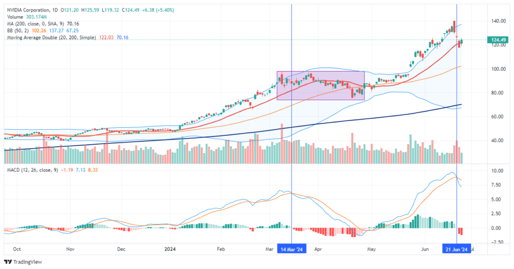
Over the last three days, the mainstream financial media has expressed much angst about the 13% decline in Nvidia (NVDA) shares. Of course, as noted yesterday, Nvidia is a leader in the technology sector (in terms of weighting), and its decline has impacted the entire S&P 500.
As discussed on the Real Investment Show yesterday, despite the nail-biting by the mainstream media and Nvidia bears discussing the end of the A.I. run, the reality was that portfolio managers were overweight shares of Nvidia heading into month end given the post-split run up, and options expiration last Friday, all contributed to the short-term bought of selling. As shown, it is not surprising that Nvidia found support at the 20-DMA and bounced sharply higher as the “A.I. chase” is still in full swing and buyers were looking for a dip to buy.
Notably, while NVDA held support at the 20-DMA and will likely push back towards $135-140/share, we suggest using that rally to rebalance risk. The last time NVDA triggered a MACD “sell signal,” the stock retested the previous highs and drifted lower for a month to reverse the overbought condition. We suspect we could see similar action over the next couple of months heading into the summer. While there is still much momentum behind NVDA, it is overbought, which will likely limit the current upside. To some degree, a reversal would provide a much better entry point to rebuild or increase exposures as needed.
TPA Spots A Rare Divergence Worth Following
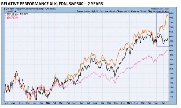
Jeffrey Marcus of TPA Analytics recently provided his subscribers with a summary of a critical ETF divergence. The first graph below, from his article, compares the price performance of FDN (internet stocks) and XLK (technology stocks). Nearly 50% of XLK is comprised of Microsoft, Apple, and Nvidia. Amazon, Meta, and Google make up about 30% of the FDN internet ETF. As shown, the two indexes tend to correlate very well. However, recently, they have diverged. Consequently, the unusual price behavior has resulted in what Jefferey believes is a good trade opportunity.
SimpleVisor subscribers can add Jeffrey’s TPA-RRG summary to their subscription package. TPA-RRG analyzes momentum and relative strength to help pick stocks and sectors likely to outperform or underperform the market. XLK is among the best performers, and FDN is near the bottom. Jeffery also points out that the RSI on the top four XLK stocks are decently overbought. As such, he offers the following advice:
Focusing on the 14-day RSI, it is clear that the top 4 stocks on XLK have gotten ahead of themselves (they are overbought). TPA expects that in the next several weeks, a convergence of XLK and FDN will be seen. This would demand that AMZN, META, GOOGL, and GOOG outperform MSFT, AAPL, NVDA, and AVG as the long-term pattern of correlated performance returns.
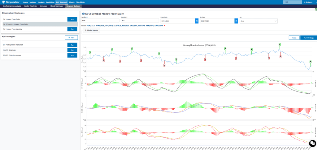
The second graphic from SimpleVisor compares the price ratio of FDN to XLK. It too shows that the pair is grossly oversold (FDN compared to XLK), thus supporting TPA’s view that FDN is likely due for better returns than XLK in the coming weeks.
Sector Performance Following Rate Cuts
The Strategas graphic below shows how each sector performed in the six months following the first cut since 1995. Strategas sorts the sectors left to right by the average return. Utilities, staples, and healthcare have the three highest averages. Utilities are the only sector that was positive in all four instances. The recent leading market sector, technology, has the worst average, including two double-digit declines.

Tweet of the Day

“Want to achieve better long-term success in managing your portfolio? Here are our 15-trading rules for managing market risks.”
Related: Buybacks Are Back