Creating a website for your insurance business is one of the essential tools to increase its visibility. Whatever budget, a website needs to be set up correctly to make sure people can find it and effectively represent your company.
You’ll also want to avoid common mistakes.
To get started, you need to determine the purpose of your website. Is it meant to generate leads? To educate potential customers? Once you know the purpose, you can start mapping out a plan for your website.
Your website should be designed with your target customer in mind. For example, your website should be professional yet approachable if you’re targeting small business owners.
When it comes to the content of your website, make sure it is well-written and relevant.
You don’t want to have too much text on each page, which can be overwhelming for visitors. Instead, focus on quality over quantity.
In the guide, we discuss these and many other things on this insurance website.
Why Should You Care About Insurance Agency Websites?
An effective website is vital for any business, but this is especially true for insurance agencies. In such a competitive field, it’s essential to stand out from the rest, and having a great website is one way to do that.
A well-designed website will help you communicate what makes your agency unique, but it will also serve as a valuable lead generation tool. By including calls to action and forms, you can encourage website visitors to get in touch with you about their insurance needs.
Everything is going digital, and your website is a digital asset that you own, not like social platforms that can delete your account anytime.
An insurance agency website is also a great way to build trust with potential customers. In addition to providing information about your agency, you can also use your website to share resources and helpful articles.
You’ll be more likely to convert website visitors into leads and, eventually, customers by demonstrating your expertise.
Examples of well-done Insurance agency websites

Ladder
Ladder does a great job at hitting several key factors without being overwhelming.
With minimal text and quality imagery, you are met with a strong tagline, letting people know that there is something for even the budget-conscious and light social proof showing that others are applying right now.
Further down, they also show that it’s a simple 3 step process to apply.
This site is definitely one to check out if you are planning your insurance agency website.
Takeaway: Simplicity in design plus social proof is a winning strategy in building a conversion-focused insurance website.
New York Life
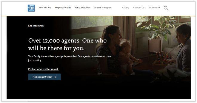
New York Life has a good website to reference if you are looking at the best way to have a content/product-focused web design.
They start strong, letting you know they are established, and if you need an insurance agent, they have over 12,000 agents to choose from.
Storytelling is one of the strongest elements you can add to your websites. New York Life does this in a way that not many take on with a video and book series to get the importance of life insurance across without being salesy or pushy.
Takeaway: Use storytelling in your web design to help deliver your message in a relatable and informative way to help drive conversions on your website.
Haven Life
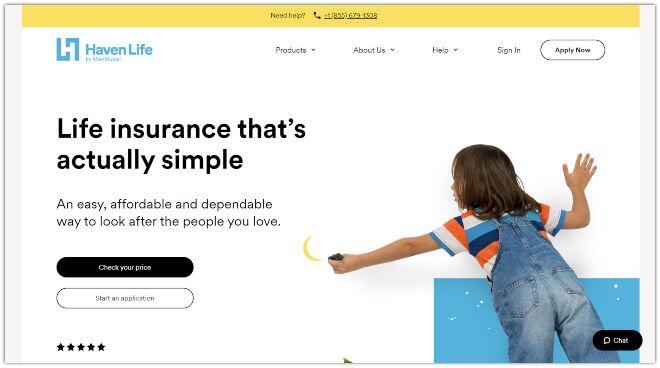
HavenLife did a fantastic job with its web design. It’s clean custom and really brings home the tagline of looking after the people you love.
Their call to action is clear and guides them directly to their money pages. The color scheme is bright and inviting and works well with the visuals and messaging of the site.
Takeaway: Insurance agency websites need to compete by investing in premium work, such as custom content and landing pages, to ensure that the messaging, visuals, and flow match in order to convert more people into leads while still being user-friendly.
Insurance Agency Website Design and Flow Strategy
The design and flow of your website can make the difference between a conversion machine and a dud. The design of your insurance agency website is essential to success in today’s digital age.
Your website is often the first interaction a potential customer has with your brand.
With thousands of others out there offering similar things, keep these design tips in mind when you’re ready to design your insurance agency website:
Keep it simple
An independent insurance agency must have a clean and easy-to-use website. Your goal should help your audience find the correct information as fast as possible.
Don’t try every little feature available if you are building the website yourself. Instead, use an insurance website template or have a web designer create a custom website for you.
Use a good media mix
You can go in many different directions when building out new pages, from text to images, to videos, audio, infographics, etc.
Google loves websites with a good media mix, so it’s not just your website visitors that will appreciate it.
Tip: Video content currently has more than 80% of the attention amongst web users. This is because visitor engagement increases, and the visitor stays around longer too.
Videos help you increase traffic to your site and increase organic web traffic by 15%. So be sure to add relevant videos to your site as often as possible.
Make it personal
If someone is looking through your insurance website or client testimonials, then they’ll usually go through your profile page.
This will help people connect more effectively with your business online. Nowadays, consumers want to know about you even more so on a personal level.
A brief bio for your insurance agents that go beyond business can go a long way toward how your insurance business is perceived.
Take photos instead of using stock photos of your insurance agents. Post more than just awards or press releases on your agency news page.
Call-to-action
CTAs can lead users to take specific actions you want them to make on your site. For example, it can boost conversion rates and assist in guiding people toward your preferred insurance products and close more insurance sales.
Insurance websites do not differ from other websites; intelligent and well-designed CTAs will transform visitors into prospects.
Quote forms and contact forms are a couple of the most effective ways to get people to take action on your site but make sure it is placed well and easy to find.
Your CTA should be:
- Relevant – The offer should be something that speaks to the needs of your target audience.
- Urgent – Use words like “act now” or “limited time only” to create a sense of urgency.
- Easy to understand – Be sure your CTA is clear and easy to understand. Don’t use jargon that your audience might not be familiar with.
- Actionable – Use strong verbs like “discover,” “learn,” or “get.”
Be sure to test different CTA placements and buttons to see what works best for your website visitors.
Be supportive
When launching community or blog pages, having a knowledge base or having live-chat functionality will show your website visitors that you are available to help and support them through their insurance journey.
Your insurance agency’s website is one of the most essential marketing tools you have. Although it works for you 24/7, having a solution that can help your target customers will go a long way.
When appropriately done, insurance websites can be highly effective at impressing the audience.
Contact made easy
Some large insurance agencies and independent insurance agents have a website where the contact information is hard to find.
If you want your insurance website actually to help you grow your business online, you have to make getting in touch as frictionless as possible.
I have seen many times where on the home page, everything is fine, but once you get to the inner web page, it’s hard to find what you are looking for.
This is vital in making sure you have a user-friendly website that is not confusing to visitors.
Put your contact information on every single page on your website to ensure that if someone wants to get in touch, they can quickly get in touch.
Responsive website design
Potential clients need to be able to access insurance websites from different devices. Therefore, being mobile-friendly is a must if you want your insurance site to bet you more leads.
Even with only a tiny portion of the visits coming from tablets, you don’t want to miss the opportunity of filling your pipeline when your ideal customer visits your insurance website.
Find out about the devices your visitors are using when they visit your website can be found on Google Analytics.
Customer Login/Portal
When strategizing your new website development needs, a customer portal should be something you strongly consider.
The added private access to personal documents allows users to save valuable time and gives the clients the ability to handle specific tasks on their own.
This frees up your insurance agents and customer service from calls that take away from a task that can actually generate more business.
The navigation
You have to make sure it is easy for visitors to find their way around your website. Therefore, the navigation should be intuitive and easy to understand.
Your insurance website navigation should be:
- Easy to see
- Has all relevant money pages
- Helpful
- Organized to help visitors find what is most relevant to them
The footer is often an overlooked area of a website, but it can actually be quite helpful.
The footer of your insurance website should include:
- A clickable map to help visitors find your office locations
- Your contact information
- Links to your social media accounts
- Any relevant disclaimers
Fonts
Everyone has different views about which font is more attractive.
The main principles for choosing fonts for your website include:
- Use fonts that are easy to read
- Use fonts that are attractive and reflect your brand
- Use fonts that are legible on different devices
- Use fonts that are easy to navigate
When choosing fonts for your website, it’s essential to keep in mind how they look on different devices and how easy they will be to read.
You also want to make sure that your fonts reflect your brand and are easy to navigate.
Pictures and Graphics
When it comes to images for your insurance website, you want to make sure that you are using high-quality and original images.
This will help improve the overall look and feel of your website and help create a more professional appearance. You should also be sure to use images relevant to your business, which will help capture the attention of your audience.
Don’t overthink this part. If the images are relevant, then use them. They can always be changed later.
It is your own site, so original images are also recommended. You want to begin to create familiarity with your brand, so why wouldn’t you have actual images of your office, so your space feels familiar to them when they walk in.
Loading Time
When your page takes more than five seconds to load, it will displease your potential customers.
After images do not load in the browser, approximately 39% of visitors will abandon a website.
This is a huge factor in your site being considered mobile-friendly.
If you decide to use an insurance website builder, be sure you research and test this out before fully committing since site speed is usually lacking on many of them.
You are losing favor with search engines as well if your site loads slowly. So, this is not something you want to put off.
Focusing on site speed early on will make it easier to maintain instead of having dozens of pages with problems you have to troubleshoot.
The Written Content
You may have heard the term copywriting, where you create content in a way that speaks about your business in a way that attracts visitors’ attention and keeps them on the site consuming the information you are providing on the site.
Your website’s written content should:
- Be engaging and interesting to read
- Include relevant keywords for SEO purposes
- Be well-written and free of errors
- Provide valuable information to your audience
- Be easy to understand
When it comes to a website, the written content is essential for a number of reasons. First, it needs to be well-written and free of errors, but it also needs to be engaging and interesting to read.
In addition, your website’s written content should include relevant keywords for SEO purposes and provide valuable information to your audience.
Testimonials/Reviews
88% of consumers have read online reviews. Testimonials help you gain the most leads, especially if they are from nonbias third-party sources.
Therefore, it’s essential to have testimonials on your insurance agency website.
Reviews help build trust with potential customers. Also, case studies are a type of review that can showcase your work for other clients in the past.
Description of products and services
When it comes to your insurance product pages and services, stay away from using industry jargon.
Your potential customers are not as familiar with insurance terms as you are. Use language that is easy for them to understand so they can make informed decisions about their coverage.
Convey the most essential information as clearly and concisely as possible. Consider using lists and other formatting techniques to make your product descriptions easy to scan and understand.
And finally, don’t forget to include a call-to-action on your product pages! You want your visitors to know what they can do next, whether it’s contacting you for more information or buying a policy online.
About Page
If someone is buying an insurance plan that will cost tens of thousands of dollars, they need to trust that you will take care of them.
Your about page is the place on your insurance website where you can brag about yourself and share whatever you want about your agency. Save the for this single page as the other web pages should be about your audience.
Be sure to have your team of insurance agents listed on the page as well, or at least a visible link so they can learn more about the people who represent your agency.
Search Engine Optimization
Your insurance website design is not just about looks but discoverability as well. Therefore, your web design needs to be structured in a way that search engines can understand what your site is all about.
Your site must have H1 and H2 tags, meta descriptions, an SSL certificate, the right keywords, and plenty of content that’s updated regularly.
A great insurance website also focuses on local SEO and local citations with your agency name, address, and phone, matching your verified information on your Googe Profile Business Page.
Local Seo is a great way to get more traffic from people near your location that likely wouldn’t find you through organic search.
Opt-in Forms for Email Marketing
You’ll also need a way for your visitors to sign up for your email list. This is typically done using an opt-in form on your insurance website.
There are a few places you can put your opt-in form, but we recommend putting it in a prominent location like the sidebar or header of your site. You could also put it in the footer area at the bottom of your site.
Email marketing is huge for nurturing and staying in touch with prospects. One of the best places to drive more sign up is from your site.
Social Media Links
You should also be on social media sites like Facebook, Twitter, and LinkedIn.
You can use social media to drive traffic back to your site, share your content, and build relationships with potential customers.
Just be sure you’re staying active and engaging with your audience.
Google understands that a business owner will set up business pages for their business nowadays.
So having branded pages for your agency on social media is crucial for creating an excellent insurance website.
Best Insurance Website Builder
If you’re like most people, you probably don’t have the time or energy to build a website from scratch. Fortunately, plenty of website builders can help you get the job done quickly and easily.
These platforms provide customizable templates, drag-and-drop features, and easy-to-use tools that simplify web development.
Some of the most popular website builders include WordPress, Webflow, Card, and Weebly, and we’ll give you a quick overview if you are looking for the best website builders for insurance agents and agencies.
WordPress plus Elementor
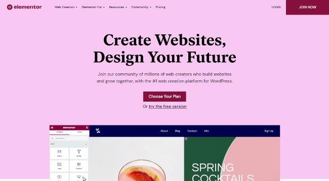
WordPress with Elementor is our top recommendation for building an insurance website that will grow with you.
Elementor is a WordPress plugin that lets you create custom website designs with drag and drop. It’s easy to use, even if you’re not a designer.
Why we like it:
* It’s easy to use, and you can create custom designs with drag and drop.
* You can start for free, but I recommend getting a premium version.
* Premium versions start at only $49 per year for a single site license.
Learn more about Elementor.com
Webflow
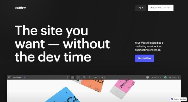
As with most website builders, Webflow provides an easy way to create an insurance website quickly.
The Universal site creator Webflow is an easy and reliable insurance websites builders tool. It provides many professionally designed templates to choose from.
These templates are very easily configurable to give you more flexibility in how you present your site. In addition, WebFlow integrates well with other marketing software, including Google Analytics.
Why we like it:
- Reliable: Webflow is a reliable website builder that is perfect for those who are looking to create an insurance website quickly.
- Flexible: With its easy-to-use templates and configurable options, Webflow provides a great deal of flexibility in how you can present your site.
- Animation engine: The web animation engine allows you to create engaging websites with a wide variety of animation features.
Weebly
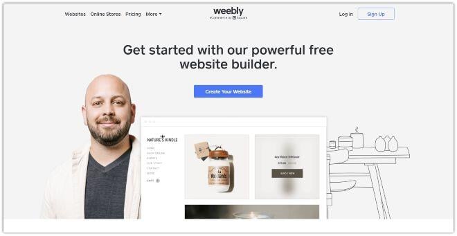
Weebly website templates and apps are an attractive and easy choice for building insurance websites. Weebly has excellent drag and drop features that are easy to pick up for novices.
They also have a selection of marketing tools where you can run a large part of your campaigns right from Weebly’s integrated marketing platform.
Why we like it:
- Ease of use: Weebly is one of the easiest website builders on the market. You can have a website up and running in minutes without any previous experience.
- Functionality: Even though Weebly is easy to use, it still has a lot of features and functionality. You can add e-commerce, blog, and native apps.
- Integrations: Weebly has a massive selection of apps that you can integrate with your website to add more functionality.
Card
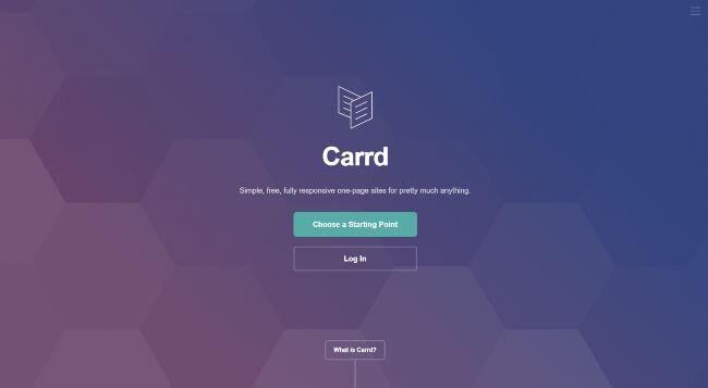
Card is a great insurance website builder for any insurance agent looking for an affordable website to house their site.
Carrd’s website builder offers a sleek and minimalist website that is very easily maintained.
Why we like it:
- The simplicity of the site
- The affordability
- The easy to use interface
Life insurance Website FAQ
Why do insurance agents need a website?
An insurance agent’s website helps build trust with potential clients and customers. It also provides a place for agents to showcase their knowledge and expertise on the available insurance coverage types.
In addition, an insurance agent’s website can help generate leads and sales by providing quotes and contact information.
How do I promote myself as an insurance agent?
There are a few key ways to promote yourself as an insurance agent. First, you need to have a solid online presence.
This means having a website that is up-to-date and informative. You should also be active on social media and ensure that potential clients can easily find you online.
Another important way to promote yourself is through networking. Attend local business events and get to know other professionals in your community.
Refer potential clients to other businesses when appropriate, and they will likely return the favor.
Finally, always provide top-notch customer service.
This includes being responsive to client inquiries, providing clear and accurate information, and going above and beyond to meet their needs.

