Written by: Blair Kelly
You hear “buzzwords” or keywords in every industry, and when it comes to website redesign, there are many different terms that you hear often! When you are going to be starting to build a website or redesigning the one that you already have, it’s important to know what designers mean when they say these words. Check out the top 16 words that we thought you should know when working to make your website awesome!1. Analytics
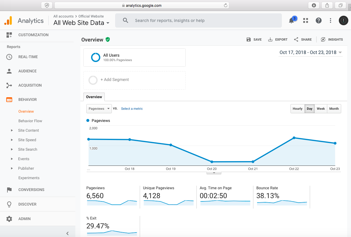
When you are trying to drive traffic to your website and increase your numbers, you need to be checking in to see how your site is performing. When it’s time to do this, you need to turn to help from Google Analytics. This refers to the numerical tracking of visitors to your website. Up to 10,000 different metrics can be tracked, which can be overwhelming, so to simplify, some of the ones that we like to use are: 1. DEMOGRAPHICSYou want to see who is actually visiting your site. This information is pertinent to ensure that you are continually updating and creating a site that will continue to grow your business. 2. ACQUISITIONAcquisition is all about driving traffic to your site and attracting visitors, and this helps to find out how they got there! With analytics, it can show you how visitors found your site, whether through organic search, social media, email campaigns, direct, and referral traffic. 3. LANDING PAGE PERFORMANCEWhat landing pages are performing the best on your site? These are designed for the purpose to convert website visitors into leads. It’s where your prospects “land” after clicking other marketing links from an email campaign or another call to action. 4. TIME SPENTHow long are your visitors spending on your site? Keeping an eye on this particular metric within your Google Analytics is important because it will help you to better understand if your visitors are reading, learning, and enjoying the content that is there. Typically, we tell advisors that anything above a two-minute session duration is very good for a niche. 5. UNIQUE PAGE VIEWSThis is the number of individual people who have viewed a specific page at least once during a visit. So, if a visitor checks out a page during the visit more than once, only the first time they visit actually counts.
2. Backend
A website “backend” is a way to refer to a website’s content management system or server. This is the part that your visitors don’t see, as it is where you log-in and make changes to your website. The code that designers work with on the backend handle technical things, such as, redirects or templates.3. Content Management System (CMS)
A content management system, or CMS, is a program that lives on a web server. It is a platform that allows you to create and manage your website’s digital content. Additionally, the content is stored in a database and combines it with web template files to create web pages that make up your website. Investing in a strong CMS can help to really bolster your firm’s online presence. We obviously think that every website needs one, and here are some reasons why! 1. THERE IS NO CODING EXPERIENCE NECESSARYThis part is so awesome, as many people don’t have coding experience, and that is totally okay! In order to make website updates, you don’t have to do anything technical. Within a CMS, your web content, such as, images and text, can very easily be inserted and uploaded onto specific pages and styled in a content editor that is similar to Microsoft Word. 2. THEY ARE SEARCH ENGINE FRIENDLYCMS’ usually offer many great tools that can help your website to rank higher in search engines, which is obviously great for when it comes to drives traffic to your website. 3. SECURESecurity is extremely important for any website, but especially in the financial industry. The last thing that you want is for your website to be hacked, especially when it may contain valuable client information. If you use a Twenty Over Ten CMS, then all of our websites are SSL secure so you won’t need to worry! 4. COST EFFICIENTIf you have a static website, then maintenance really starts to add up. Every time you need a fix, you will have to call a designer or developer, and those expenses can really start to add up. 5. EASILY ACCESSIBLEMultiple people have access to your website, as well as, the ability to collaborate. Using individual accounts, multiple people can add, edit, or update content on the site right from their own computer or other devices. 6. QUICK MAINTENANCEWithout a CMS, making changes to your site can be both time-consuming and expensive. If you do have one, however, the platform is continuously updated to fix any glitches in the system, and it saves you a lot of time!
4. Call to Action (CTA)
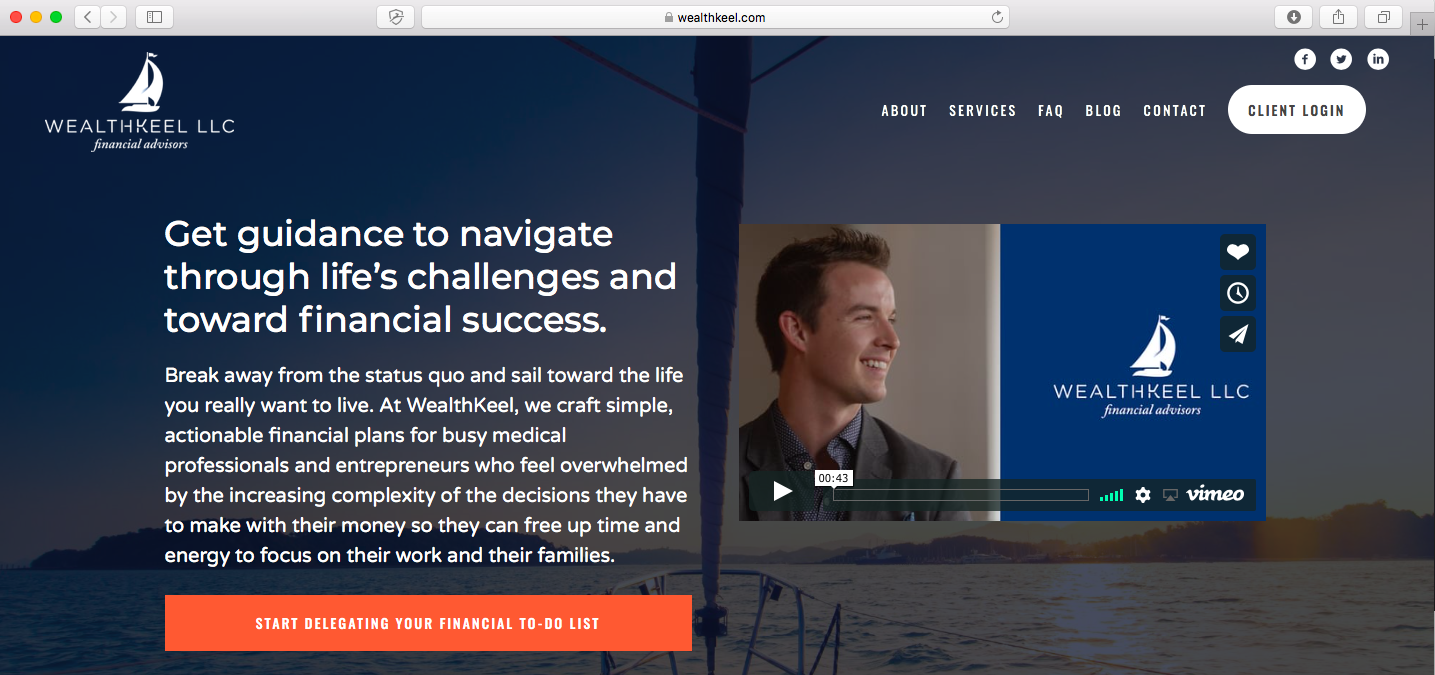
A call to action, or CTA, is a button, graphics or text link that encourages your visitor to take an action. Some of these might include: subscribing to your blog, signing up for monthly email updates, or requesting a product demo. If you aren’t seeing the results that you expected when it comes to driving traffic to your website, you might be missing a CTA!When executed correctly, these can give visitors that extra push that they need to take action. Hopefully, they will go from visitors to clients! In the above image, Twenty Over Ten client, WealthKeel, LLC, uses strong words in their CTA. “Start Delegating Your Financial To-Do List.” It also uses an orange color so that it stands out on the page, further encouraging action.
5. Domain Name
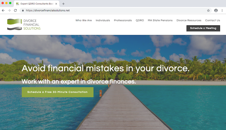
Domain name is your website address, most commonly ending in .com, .net or .org. You can buy these through a domain registrar, and these names point to web servers that contain your website.Your domain name can have a huge impact in terms of your website’s click-through rate, from rankings in search engines, and many other factors. The name that you choose can have a huge impact on your firm’s online presence, which is why it’s so when it comes to picking one!In the image below, for Twenty Over Ten’s client, Divorce Financial Solutions, it is obvious what type of finances they handle based on the company name and domain alone.
6. Hosting
Hosting, or “web hosting,” is the method of making your website available to the public on a web server, a computer that’s always hooked up to the Internet. You need this in order to make your website available to the public, additionally, you’ll have the choice between “shared hosting,” “managed hosting,” or “dedicated hosting.” 1. SHARED HOSTINGShared Hosting is the least costly option, however, it requires you to share a server. 2. MANAGED HOSTINGThis type of hosting means that a hosting company has server engineers available to manage your server for you. 3. DEDICATED HOSTINGDedicated hosting means that your website or websites are on their own server, which is more secure.7. HTML (HyperText Markup Language)
You have probably seen “HTML” many times, but did you know that it stands for HyperText Markup Language? Simply put, it is a web programming language that tells web browsers, such as, Google Chrome, how to render words, pictures, audio and video on your web pages.8. Landing Pages
What exactly is a landing page? Well, it’s the section of a website accessed by clicking a hyperlink on another web page, and this typically the website’s home page, even though it doesn’t have to always be that page!Landing pages are an awesome tool to increase lead generation, mainly because they allow you to create individualized messages for different, targeted niches. When you use one, you can tailor your message to be ultra-specific, as there is one headline, one unique selling proposition, and one call to action. When you target one specific niche, then that really increases your chances of driving traffic and therefore gaining new clients. Twenty Over Ten client, Labrum Wealth Management, uses this as a landing page with a tailored message, giving visitors the chance to sign up for their “8 Steps to Financial Detox.”
9. Lead Form
These are forms that can be placed on any page of your website. They can be filled out in order to download something on your page, such as a whitepaper or e-book or to get some information. For the above image, Brian Plain, CFP, has a form to fill out with your information so that you can receive a free e-book. By doing this, he now has your information in order to contact you in the future, as well as, now has the opportunity to provide you with something of value that is also FREE.Related: How to Integrate a Robo-Advisor Offering on Your WebsiteRelated: 5 Ways to Generate Website Traffic to Your Advisor Website Fast
10. Mock Up/Staging Site
This is simply a picture of how your website will look on a screen once it is completed. It’s not “working” yet, so nobody can click on it or access it yet. You just want to be able to provide the client with an example of what the site will look like to ensure that everything is headed in the right direction! There are two types, and they are high fidelity mockups and low fidelity mockups. HIGH FIDELITY MOCKUPHigh fidelity mockups will have the exact wording, photographs and literally, will be a picture of how your website will look when it’s finished. LOW FIDELITY MOCKUPA low fidelity mockup may have words or photographs for placement purposes only to show where certain elements will be placed on the screen.11. Parallax Scrolling
Twenty Oven Ten offers many different frameworks when building a website, and one of the options that you can choose is parallax scrolling. This is where a background image moves slower than the foreground image or text, which in turn, will create an illusion of depth and adds a sense of immersion.Our Iris framework offers this type of option on your website. It’s a single page scrolling site making for simple navigation with a feeling of interaction. As visitors scroll, page banners fade away as the header space shrinks featuring an easily accessible navigation bar. Content is separated by vertically stacked divider images, and there is parallax scrolling. Twenty Over Ten client, IRC Wealth, uses parallax scrolling on the website in the image above. As you continue the scroll, it appears as if the girl hiking is moving, when actually the image is staying the same while the foreground text moves. It gives the page a sense of depth and makes it more 3-Dimensional.
12. Responsive Design
This is a design and coding technique that ensure that your website is mobile-friendly. It enables your website to “respond,” or reformat itself, to the screen size it is being viewed on. These types of design are SO IMPORTANT for modern day websites, as so many people are viewing your website on their mobile devices or tablets.Mobile phones are on the way to becoming the main way that businesses and clients interact with each other! According to the Pew Research Center, 84% of affluent Americans own a smartphone. Out of that number, 89% use it for internet access, which means your website better be up to par!Without responsive design, your website will appear much smaller and be compressed, and if somebody can’t view your website “on the go,” then they will more than likely find another advisor site, and this often times will mean a competitor! In the above image, you can see that C.L. Sheldon & Company’s website is displayed on every size screen and looks great in all of them!
13. Search Engine Optimization (SEO)
The term SEO is short for Search Engine Optimization, and it is the practice of optimizing your website and overall web presence so that your business can easily be found on search engines, such as Google or Safari. When it comes to SEO (search engine optimization), financial planning firms need to excel at it so that more traffic can be driven to their site, thus converting into clients!14. Sitemap
A sitemap is an outline of how your website content will be organized. This can take the form of a Microsoft Word outline or an Excel document. It shows the high-level naming structure and hierarchy for your website and where each page will live under that structure.


